

Menu

User Flows
Concept Sketch
I explored different layout options to find the most effective way to present key information on HaiTou’s Job Posting page — the first screen users see. After evaluating three options, I selected the Option 2 for further design based on usability and layout efficiency.


Re-calibration & User Insights
After user research and data analysis, I recalibrated our goal with XFN team—not just making the UI more modern, but solving main user pain points: specifically, the lack of sponsorship transparency and JD clarity. Based on these insights, we categorized users into two key groups:
HMW Statement
Building on the recalibrated user pain points, I framed two How Might We (HMW) statements to guide ideation for each group.
For STEM Professionals
How might we help STEM professionals quickly identify H-1B-friendly positions and reduce uncertainty around sponsorship eligibility?
For Career Changers
How might we supercharge career changers’ efficiency, helping them better assess job fit and confidently apply for relevant roles?

Detailed H-1B Sponsorship Information

AI-Powered JD Clarity Enhancements


Final Prototype

Dev-ready Handoff
Delivered annotated files with responsive specs and component guidelines to support efficient engineering implementation

Web
AI-Powered Glossary Popovers
Mobile Experience Optimization
Although the web and mobile versions share the same core information architecture and task flow, I did not simply scale down the web layout. Instead, I adapted key modules to mobile usage contexts, interaction patterns, and device constraints.
For navigation, I moved the core first-level entries from the web top navigation to a bottom tab bar, making high-frequency tasks easier to access within users’ thumb zones while reducing navigation switching cost.
Jobs

Job Detail

Iteration Plan
Research and user testing revealed a key gap: after applying, users prefer powerful external job trackers over HaiTou’s. To address this, I plan to redesign the in-platform job tracker.
Brainstorming surfaced high-potential ideas like AI resume scan and JD match, which are now ready for prototyping.
Feedback highlighted demand for crowdsourced sponsor verification—letting users confirm H1B sponsorship for each job to boost data transparency and reliability.
Prototyping for next phase...

HaiTou Website Redesign

Summary
Designed a responsive job-hunting website, delivering an end-to-end user experience from concept to high-fidelity prototypes. Conducted user research and iterative design improvements, while A/B testing and performance analysis refined an AI-driven job description summary and surfaced key H-1B Information for international job seekers.

Client
Eth Tech
Timeline
12/2024 - 07/2025
Role
Product designer
Tools
Figma, Jira, Qualtrics
Team
1 PM, 1 Product Designer, 1 DA, 4 Engineers
Background
In the 2023/2024 academic year, the U.S. hosted over 1.12 million international students. Despite this growing population, many still face challenges finding jobs due to limited visa sponsorship and a competitive job market.
HaiTou is a job-hunting platform tailored for international job seekers, with an increasingly younger user base, providing sponsorship-related resources and job-tracking tools to support their job search and career goals.
Old Design
Data Points
Challenges
The platform was losing users
Over the past six months, despite sustained high demand for job-hunting information, the metrics indicate an overall decline trend.

Initiate Approach & PM’s Goal
Make UI More Modern
The PM team initially prioritized revamping the platform’s UI with a more modern and visually engaging design, aiming to improve retention among our primarily young user base.
I. Overview
II. Research
III. Define
IV. Ideate
V. Design
VI. Iteration
VII. Final Design
VIII. Impact
IX. Reflection
HaiTou Website Redesign
HaiTou Website Redesign
Summary
Summary
Designed a responsive job-hunting website, delivering an end-to-end user experience from concept to high-fidelity prototypes. Conducted user research and iterative design improvements, while A/B testing and performance analysis refined an AI-driven job description summary and surfaced key H-1B Information for international job seekers.
Designed a responsive job-hunting website, delivering an end-to-end user experience from concept to high-fidelity prototypes. Conducted user research and iterative design improvements, while A/B testing and performance analysis refined an AI-driven job description summary and surfaced key H-1B Information for international job seekers.
+16.2%
Daily Active Users
+12.9%
User Satisfaction
+22.4%
Conversion Rates
+8%
User Retention
Client
Client
Eth Tech
Eth Tech
Timeline
Timeline
05/2025 - 12/2025
05/2025 - 12/2025
Role
Role
Product Designer
Product Designer
Tools
Tools
Figma, Jira, Qualtrics
Figma, Jira, Qualtrics
Team
Team
1 PM, 1 Product Designer, 1 DA, 4 Engineers
1 PM, 1 Product Designer, 1 DA, 4 Engineers
Background
Background
In the 2023/2024 academic year, the U.S. hosted over 1.12 million international students. Despite this growing population, many still face challenges finding jobs due to limited visa sponsorship and a competitive job market.
HaiTou is a job-hunting platform tailored for international job seekers, with an increasingly younger user base, providing sponsorship-related resources and job-tracking tools to support their job search and career goals.
Data Points
Data Points
Challenges
Challenges
The platform was losing users
Over the past six months, despite sustained high demand for job-hunting information, the metrics indicate an overall decline trend.
+25.3%
Drop-off Rate
More users left before clicking “Apply”, indicating drop-off during key steps
31.9%
Below Industry Averge
Consistently underperforming competitors, reflecting persistent usability issues.
-21.5%
Session time
Suggests declining engagement and possible friction in the job search flow.
-18.4%
Daily Active Users
Decline in user retention and engagement over time.
-12.7%
Conversion Rate
Fewer users clicked “Apply” after searching for jobs
Bootstrap Template
Used in MVP Version
Resulted in an inconsistent design system and limited user-centered thinking.
The platform was losing users
Over the past six months, despite sustained high demand for job-hunting information, the metrics indicate an overall decline trend.
Old Design
Old Design
Initiate Approach & PM’s Goal
Initiate Approach & PM’s Goal
Make UI More Modern
Make UI More Modern
The PM team initially prioritized revamping the platform’s UI with a more modern and visually engaging design, aiming to improve retention among our primarily young user base.

Why users were leaving?
Why users were leaving?
To validate whether the initial approach — modernizing the UI — truly addressed user needs, I first needed to understand the root causes of user drop-off. This led to a round of initial user research.
To validate whether the initial approach — modernizing the UI — truly addressed user needs, I first needed to understand the root causes of user drop-off. This led to a round of initial user research.
Research Methods & Goals
Research Methods & Goals
To understand the broader job-seeking landscape, I first launched an online survey to explore users’ platform preferences and behaviors across various job platforms, collecting 200+ responses.
Then, to explore Haitou-specific issues in depth, I recruited 25 participants for usability testing and in-depth interviews, uncovering pain points, unmet needs, and behavioral patterns contributing to user drop-off.
Platform Usage & Preferences
Platform Usage & Preferences

What drives users to choose one job platform over another?

Professional Networking & Referrals.

Straightforward Layout, No ADs and Noise.

Company Reviews and Insights.

Student-oriented, Entry-level friendly, alumni referral.

Smart job matching tools
H1B visa sponsorship Info, International job seekers-oriented
What are the most frequently used job platforms?
95%

77%
53%

46%

15%
5%
Drop off Reasons
Drop off Reasons
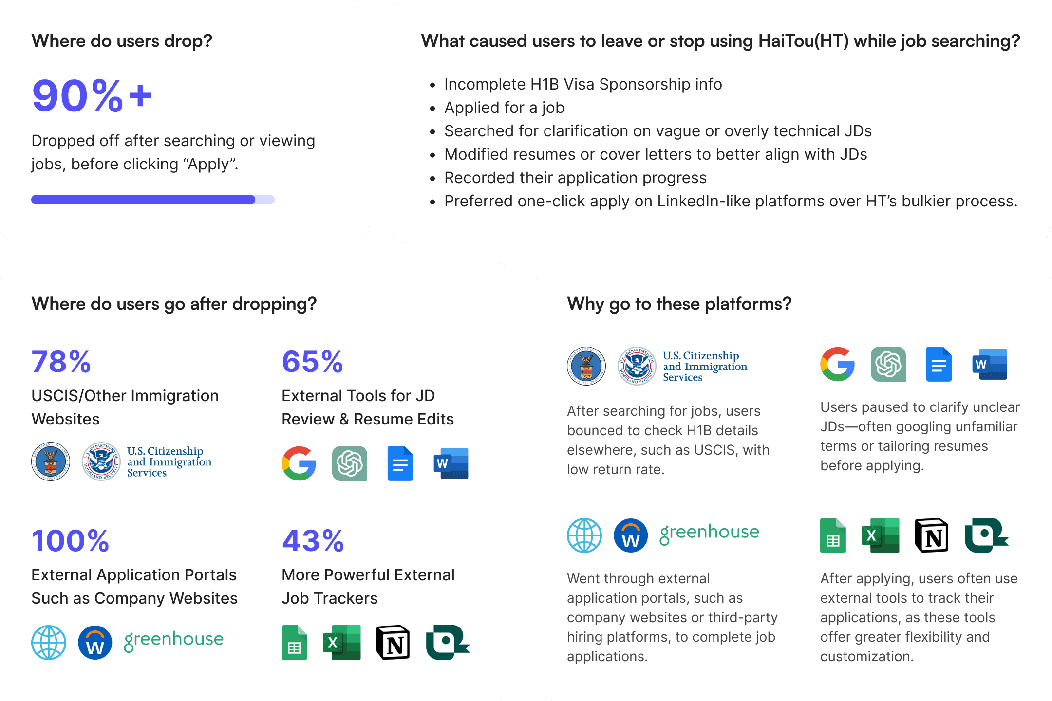
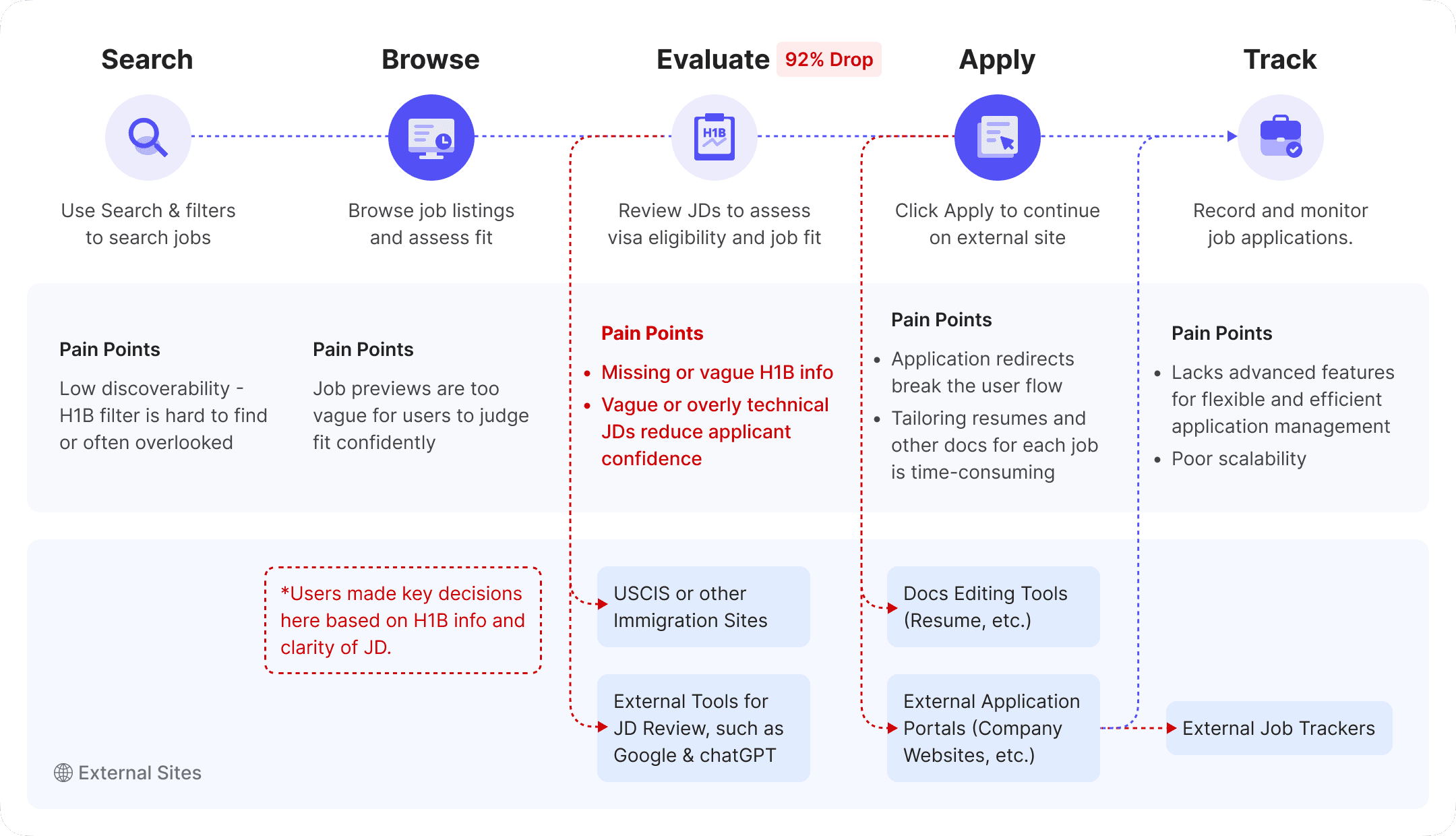
Where do users drop?
93%+
After searching or viewing jobs, before clicking “Apply”.
What caused users to leave or stop using HaiTou(HT) while job searching?
Incomplete H1B Visa Sponsorship info
Applied for a job
Searched for clarification on vague or overly technical JDs
Modified resumes or cover letters to better align with JDs
Recorded their application progress
Preferred one-click apply on LinkedIn-like platforms over HT’s bulkier process.
Where do users go after dropping?
78%
USCIS/Other Immigration Websites


65%
External Tools for JD Review & Resume Edits

100%
External Application Portals Such as Company Websites

43%
More Powerful External Job Trackers


Why go to these platforms?
After searching for jobs, users bounced to check H1B details elsewhere, such as USCIS, with low return rate.
Users paused to clarify unclear JDs—often googling unfamiliar terms or tailoring resumes before applying.

Went through external application portals, such as company websites or third-party hiring platforms, to complete job applications.
After applying, users often use external tools to track their applications, as these tools offer greater flexibility and customization.
Data Points
Data Points
User Journey Map
User Journey Map
Competitive Gap
Competitive Gap

Why users were leaving?
To validate whether the initial approach — modernizing the UI — truly addressed user needs, I first needed to understand the root causes of user drop-off. This led to a round of initial user research.
Research Methods & Goals
To understand the broader job-seeking landscape, I first launched an online survey to explore users’ platform preferences and behaviors across various job platforms, collecting 200+ responses.
Then, to explore Haitou-specific issues in depth, I recruited 25 participants for usability testing and in-depth interviews, uncovering pain points, unmet needs, and behavioral patterns contributing to user drop-off.
Platform Usage & Preferences
Drop off Reasons

Data Points
User Journey Map

Competitive Gap
Why users were leaving?
To validate whether the initial approach — modernizing the UI — truly addressed user needs, I first needed to understand the root causes of user drop-off. This led to a round of initial user research.
Research Methods & Goals
To understand the broader job-seeking landscape, I first launched an online survey to explore users’ platform preferences and behaviors across various job platforms, collecting 200+ responses.
Then, to explore Haitou-specific issues in depth, I recruited 25 participants for usability testing and in-depth interviews, uncovering pain points, unmet needs, and behavioral patterns contributing to user drop-off.
Platform Usage & Preferences
Drop off Reasons
Data Points
User Journey Map
Competitive Gap


Re-calibration & User Insights
Re-calibration & User Insights
After user research and data analysis, I recalibrated our goal with XFN team—not just making the UI more modern, but solving main user pain points: specifically, the lack of sponsorship transparency and JD clarity. Based on these insights, we categorized users into two key groups:
HMW Statement
HMW Statement
Building on the recalibrated user pain points, I framed two How Might We (HMW) statements to guide ideation for each group.
For STEM Professionals
For STEM Professionals
How might we help STEM professionals quickly identify H-1B-friendly positions and reduce uncertainty around sponsorship eligibility?
How might we help STEM professionals quickly identify H-1B-friendly positions and reduce uncertainty around sponsorship eligibility?
For Career Changers
For Career Changers
How might we supercharge career changers’ efficiency, helping them better assess job fit and confidently apply for relevant roles?
How might we supercharge career changers’ efficiency, helping them better assess job fit and confidently apply for relevant roles?

Brainstorm Solutions
Brainstorm Solutions
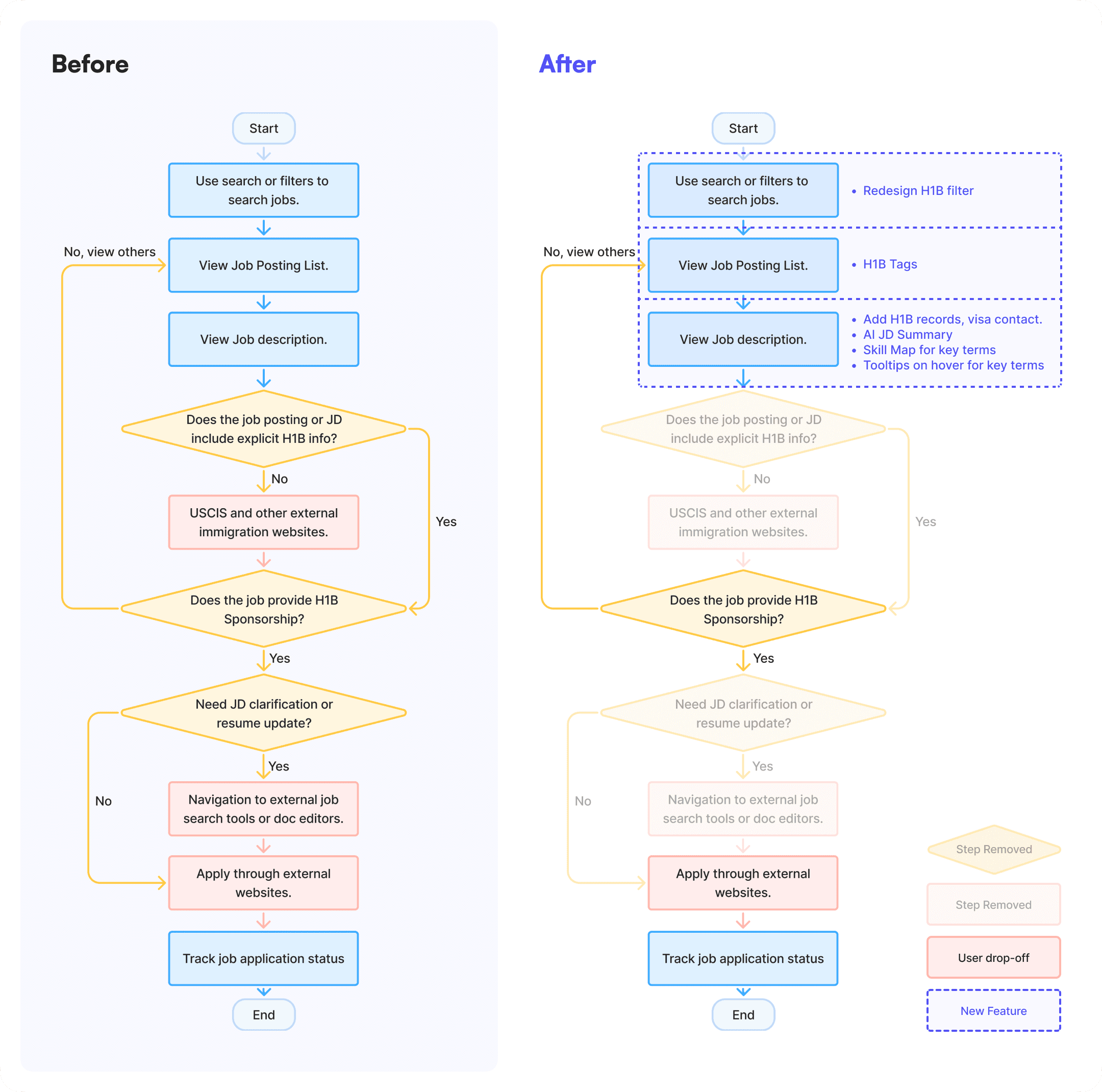
I facilitated a brainstorming session with the XFN team. For each HMW question, we collaboratively generated 25+ ideas, some inspired by my earlier competitive design analysis, others emerging organically during the session.
I facilitated a brainstorming session with the XFN team. For each HMW question, we collaboratively generated 25+ ideas, some inspired by my earlier competitive design analysis, others emerging organically during the session.
We used dot voting to surface top ideas.
We used dot voting to surface top ideas.
H1B Information
H1B Information
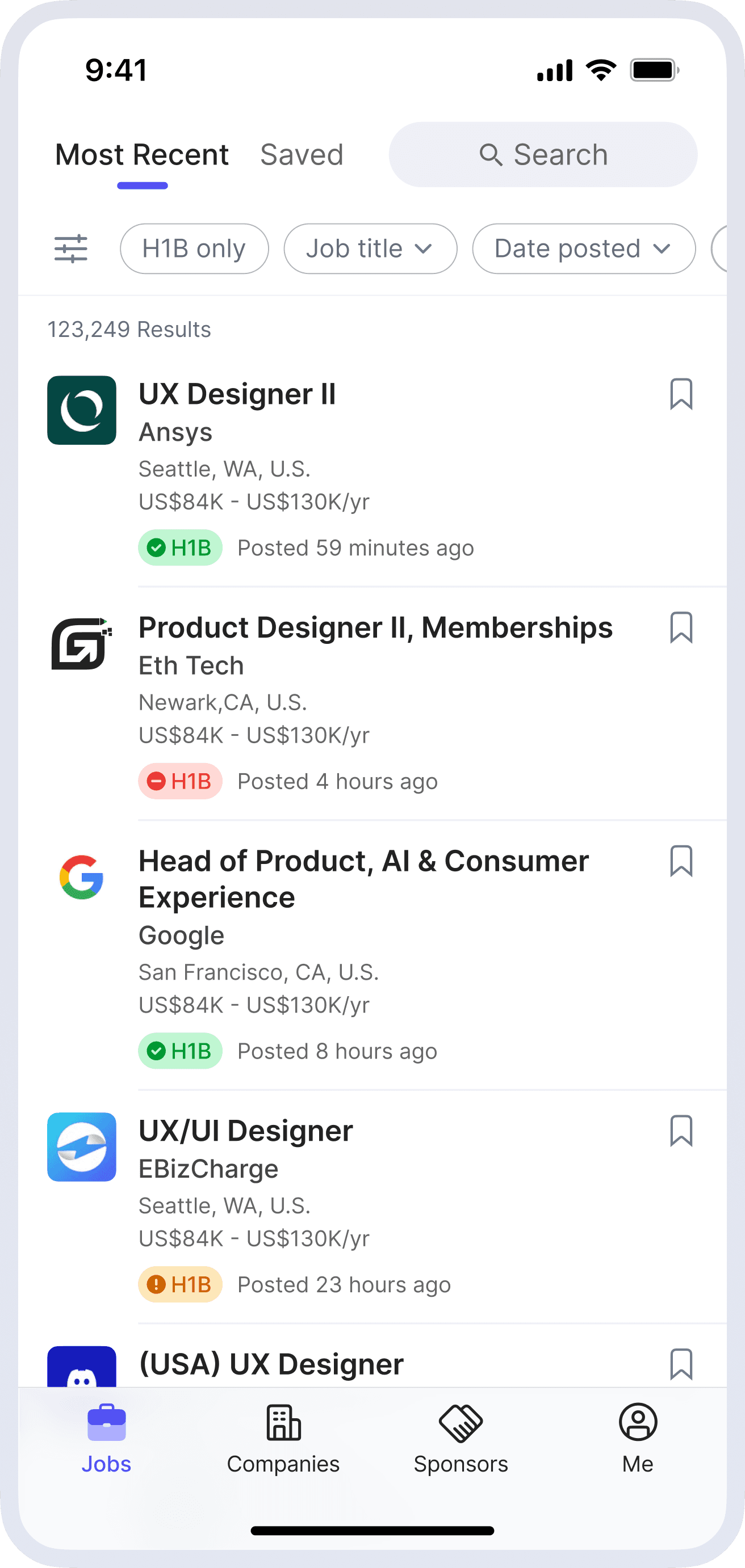
Display H-1B sponsor status in job listings and detail pages
Integrate historical H-1B approval metrics (e.g., petition volume and approval rate) into the job detail page
Highlight visa-related contact info for employers with a history of H-1B sponsorship.
Present relevant past H-1B petitions for similar job titles.
Redesign the H-1B filter to improve discoverability and usability.
AI-Powered JD Clarity Enhancements
AI-Powered JD Clarity Enhancements
Add a concise “Job Summary” section to describe key Info in JDs, such as core responsibilities.
Introduce a Skill Map to categorize and clarify key terms in JDs.
Enable tooltips on hover for complex terms with plain-language definitions on hover.
Add a concise “Job Summary” section to describe key Info in JDs, such as core responsibilities.
Introduce a Skill Map to categorize and clarify key terms in JDs.
Enable tooltips on hover for complex terms with plain-language definitions on hover.
If we have more time...
If we have more time...
Resume Scan & AI Match
Resume Scan & AI Match
Allow users to upload resumes and analyze them against JD skill keywords to identify gaps and generate a match score with clear visual feedback
Add an AI-powered one-click resume optimization feature to quickly generate a version tailored to the target role.
Allow users to upload resumes and analyze them against JD skill keywords to identify gaps and generate a match score with clear visual feedback
Add an AI-powered one-click resume optimization feature to quickly generate a version tailored to the target role.
MVP Prioritized List
MVP Prioritized List
We prioritized top ideas using five criteria: impact, feasibility, ROI, Cherry-pick, and timing.
We prioritized top ideas using five criteria: impact, feasibility, ROI, Cherry-pick, and timing.

User Flows
User Flows
Concept Sketch
Concept Sketch
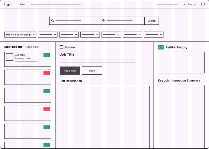
I explored different layout options to find the most effective way to present key information on HaiTou’s Job Posting page — the first screen users see. After evaluating three options, I selected the Option 2 for further design based on usability and layout efficiency.
I explored different layout options to find the most effective way to present key information on HaiTou’s Job Posting page — the first screen users see. After evaluating three options, I selected the Option 2 for further design based on usability and layout efficiency.


Option 1
Job List | JD | H1B Info + AI Summary
3 Columns
Pros
Consistent with current layout, requires minimal dev effort.
High information density with clear separation of content.
H1B Info and JD Summary always visible — improves discoverability.
Cons
The right-side H1B/AI section is detached from JD content and easily overlooked.
Risk of cognitive overload for new users.
The right panel may appear sparse when H1B records are missing or JDs are brief.
Option 2(Adopted)
Job List | JD (H1B Info + AI Summary)
2 Columns
Pros
Matches user habits on mainstream job platforms (e.g. LinkedIn).
Groups related info (H1B, JD Summary) for easier scanning and better relevance.
Responsive layout adapts well to different screen sizes and interactions.
Cons
Key information (e.g., H1B, JD Summary) may be collapsed by default, reducing visibility.
Extended content may lead to visual clutter and poor readability.

Option 3
Filters | Job List (Click to expand JDs)
3 Columns

Pros
Ideal for filter-heavy or mobile-first design.
Better exploration experience; supports fast scrolling like a feed.
Drawer-style expansion suits small screens.
Cons
Requires extra clicks to view key info — increases interaction cost.
Hard to compare multiple jobs at a glance — less efficient for decision making.

Feedback-Driven Iteration
Feedback-Driven Iteration
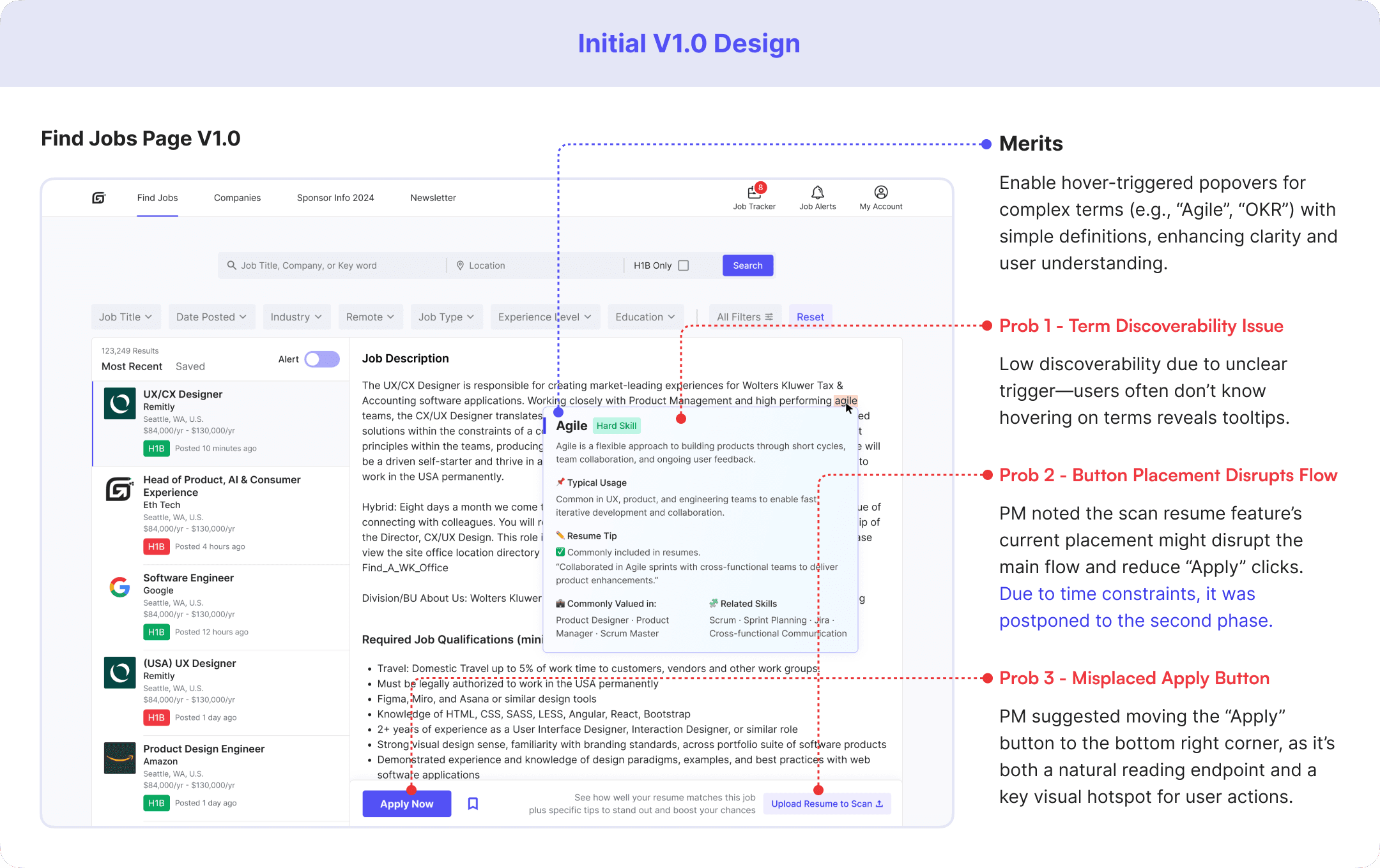
After completing the V1.0 design and initial prototype, I shared it with my PM and internal testers to gather feedback. Their feedback surfaced several usability concerns around H-1B info accuracy, tooltip discoverability, and layout hierarchy, which I addressed in the V2.0 redesign.
After completing the V1.0 design and initial prototype, I shared it with my PM and internal testers to gather feedback. Their feedback surfaced several usability concerns around H-1B info accuracy, tooltip discoverability, and layout hierarchy, which I addressed in the V2.0 redesign.

1. H-1B Info & AI Job Summary
1. H-1B Info & AI Job Summary


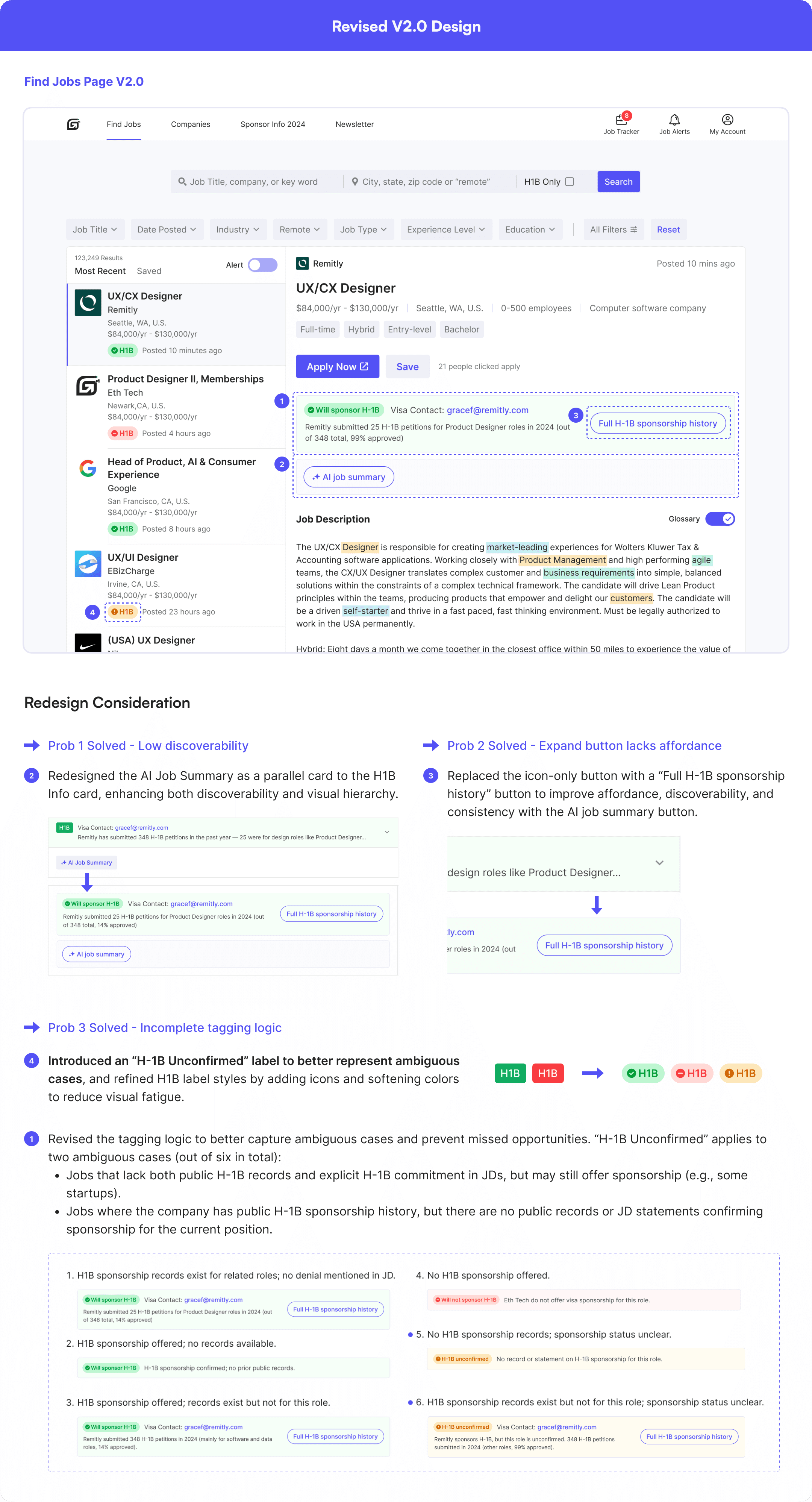

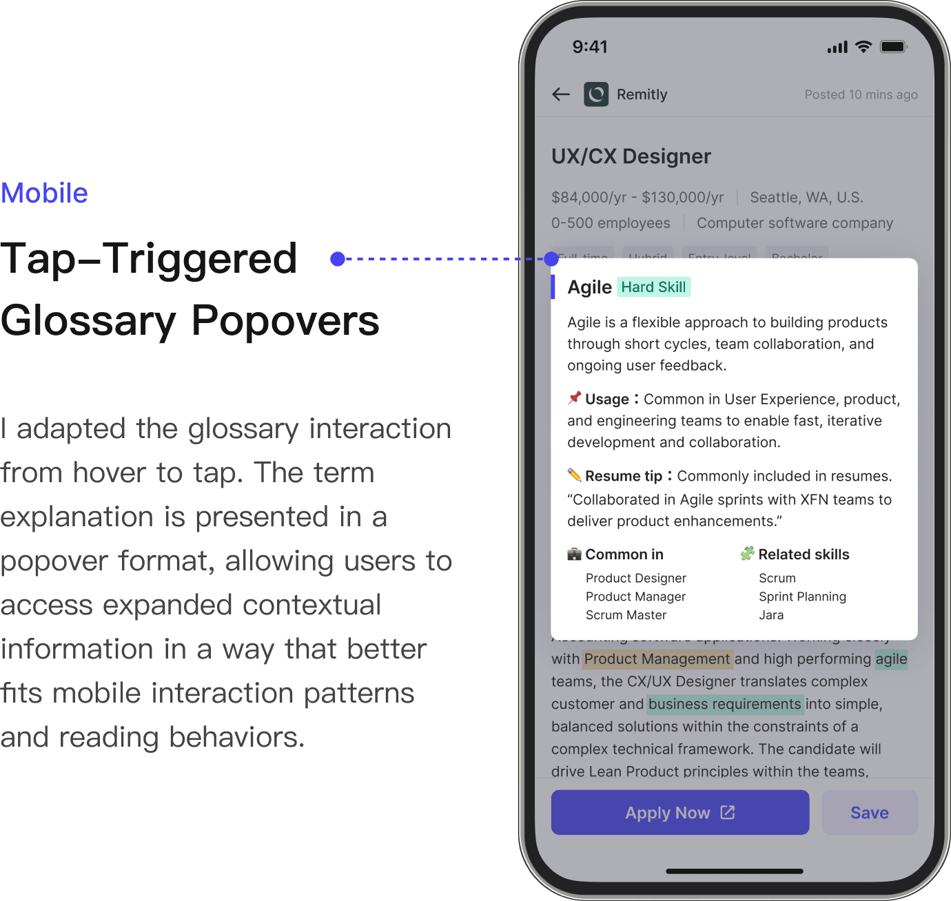
2. Hover-Triggered Popovers for Complex Terms
2. Hover-Triggered Popovers for Complex Terms

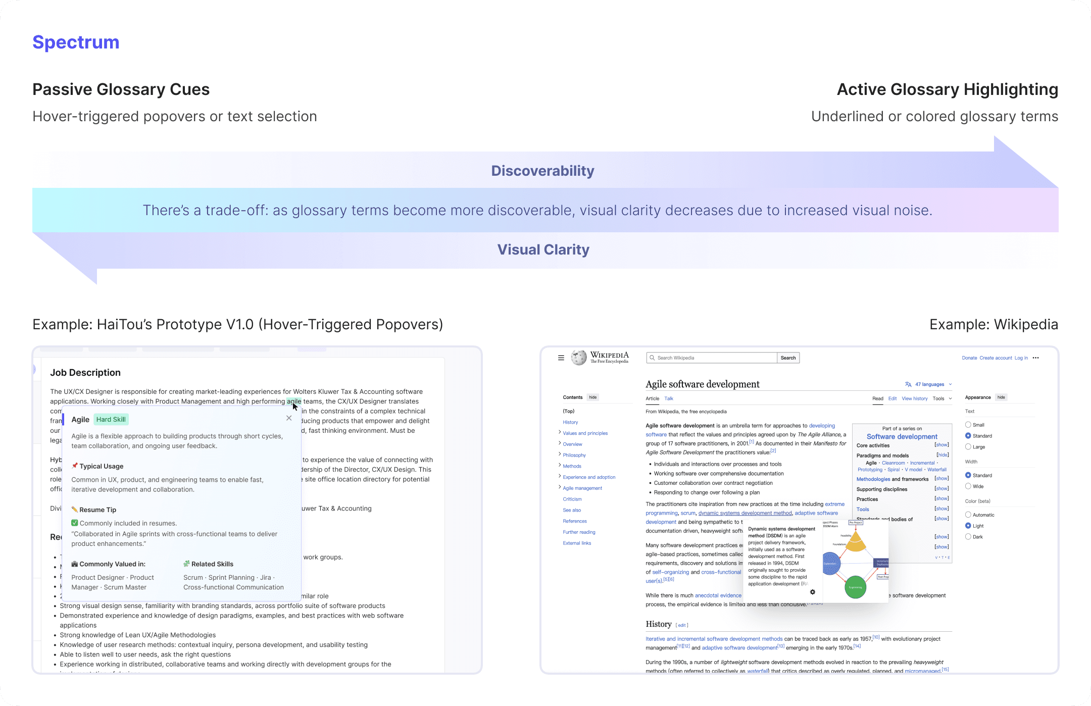
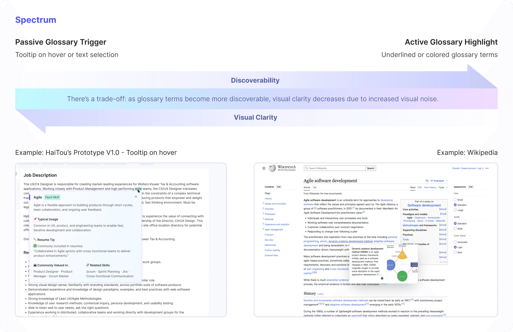
Design Research on Prob 1 - Term Visibility
Design Research on Prob 1 - Term Visibility
To address problem 1, I led design research to compare different trigger mechanisms for glossary terms and mapped a spectrum—from passive tooltips to active highlights (e.g., underlined terms like in Wikipedia).
A later test showed a 43% increase in feature adoption, as more users noticed and interacted with glossary terms.
To address problem 1, I led design research to compare different trigger mechanisms for glossary terms and mapped a spectrum—from passive tooltips to active highlights (e.g., underlined terms like in Wikipedia).
A later A/B test showed a 43% increase in feature adoption, as more users noticed and interacted with glossary terms.


Detailed H-1B Sponsorship Information
Detailed H-1B Sponsorship Information
AI-Powered JD Clarity Enhancements
AI-Powered JD Clarity Enhancements
Web
Web
AI-Powered Glossary Popovers
AI-Powered Glossary Popovers
Mobile Experience Optimization
Mobile Experience Optimization
Although the web and mobile versions share the same core information architecture and task flow, I did not simply scale down the web layout. Instead, I adapted key modules to mobile usage contexts, interaction patterns, and device constraints.
For navigation, I moved the core first-level entries from the web top navigation to a bottom tab bar, making high-frequency tasks easier to access within users’ thumb zones while reducing navigation switching cost.
虽然 Web 端与移动端在核心信息架构与主要功能逻辑上保持一致,但我并未直接沿用响应式缩放方案,而是结合移动端使用场景、交互习惯与设备特性,对关键模块进行了针对性调整,以提升跨端场景下的可用性与操作效率。
其中,导航系统是重点重构的部分。相比于简单沿用 Web 端顶部导航在移动端进行压缩呈现,我基于移动端单手操作特征、触达成本与高频任务路径,重新调整了导航层级与入口布局,将核心一级导航下移至底部 Tab Bar,以更贴合移动端用户心智和拇指热区,降低导航切换成本,提升关键任务的可达性与整体浏览效率。
Jobs
Job Detail
Final Prototype
Final Prototype
Dev-ready Handoff
Dev-ready Handoff
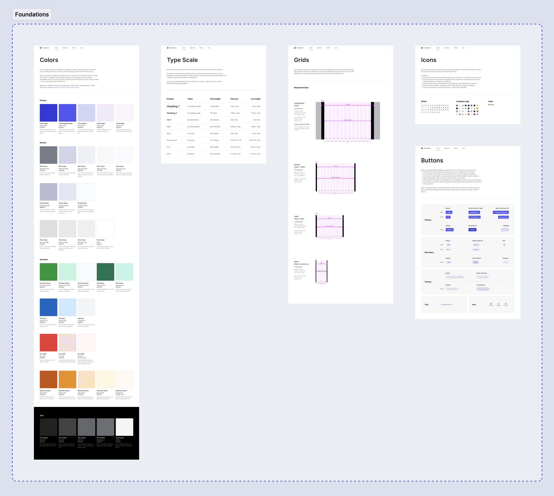
Delivered annotated files with responsive specs and component guidelines to support efficient engineering implementation

User Testing
User Testing
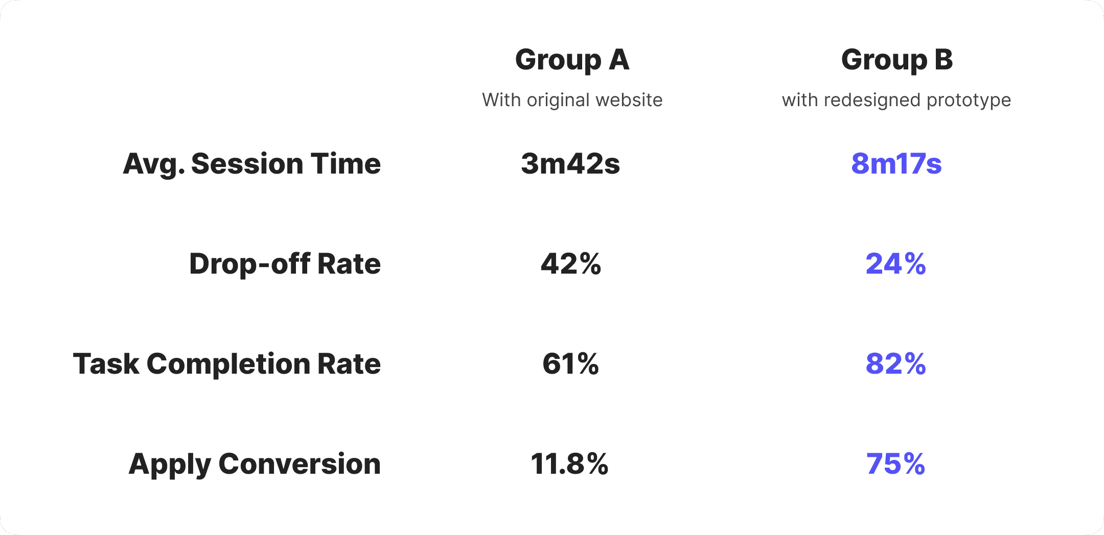
I conducted usability testing with 42 participants — 19 internal stakeholders and 23 trusted testers, both in-person and virtually.
They were split into two groups:
Group A used the original website
Group B used the redesigned prototype
Both groups browsed job listings and decided whether to apply based on their own judgment. I observed user behavior, tracked key metrics, and collected post-task feedback. The redesigned prototype showed clear improvements in average time on page and application conversion rate.
In Group B, over half of the participants actively used new features such as the H-1B information card and AI-generated job summary. Many noted that these features made it easier to quickly assess whether a role was worth applying to, helping explain the increase in application conversion.
Impact
Impact
Key metrics after partial feature release:


Testimonials

Yijun Zhang
Madison, WI, U.S.
Super Helpful for International Students!
“I’ve always found it tricky to tell which jobs actually sponsor H-1B as an F-1 student. This made it much easier—I could quickly scan roles and filter out the ones that weren’t a fit. Saved me a ton of time.”

Jessica Lee
San Jose, CA, U.S.
Clearer Visa Info at a Glance
“I really like how it shows both the H-1B tag and petition history for job titles. Most job boards don’t go into that kind of detail. It helped me focus on the ones worth applying to.”

Daniel Rivera
London, UK
Visa Contact is a Nice Touch
“Most jobs don’t say up front if they sponsor, so having someone I could contact directly was super helpful. It made things feel a lot less confusing.”

Rohan Mehta
Bengaluru, India
Quick Skill Check Saves Time
“I liked how the JD summary pulled out the must-have skills up front. It helped me figure out in seconds whether it was worth applying or not.”
Testimonials
Yijun Zhang
Super Helpful for International Students!
“I’ve always found it tricky to tell which jobs actually sponsor H-1B as an F-1 student. This made it much easier—I could quickly scan roles and filter out the ones that weren’t a fit. Saved me a ton of time.”
Madison, WI, U.S.
Daniel Rivera
Visa Contact is a Nice Touch
“Most jobs don’t say up front if they sponsor, so having someone I could contact directly was super helpful. It made things feel a lot less confusing.”
London, UK
Jessica Lee
Clearer Visa Info at a Glance
“I really like how it shows both the H-1B tag and petition history for job titles. Most job boards don’t go into that kind of detail. It helped me focus on the ones worth applying to.”
San Jose, CA, U.S.
Rohan Mehta
Quick Skill Check Saves Time
“I liked how the JD summary pulled out the must-have skills up front. It helped me figure out in seconds whether it was worth applying or not.”
Bengaluru, India
Iteration Plan
Iteration Plan
Research and user testing revealed a key gap: after applying, users prefer powerful external job trackers over HaiTou’s. To address this, I plan to redesign the in-platform job tracker.
Brainstorming surfaced high-potential ideas like AI resume scan and JD match, which are now ready for prototyping.
Feedback highlighted demand for crowdsourced sponsor verification—letting users confirm H1B sponsorship for each job to boost data transparency and reliability.
Prototyping for next phase...
Prototyping for next phase...
Job Tracker - Job list view

Job Tracker - Job board/Kanban

Job Tracker - Add application

Resume Scan & AI-Powered Match

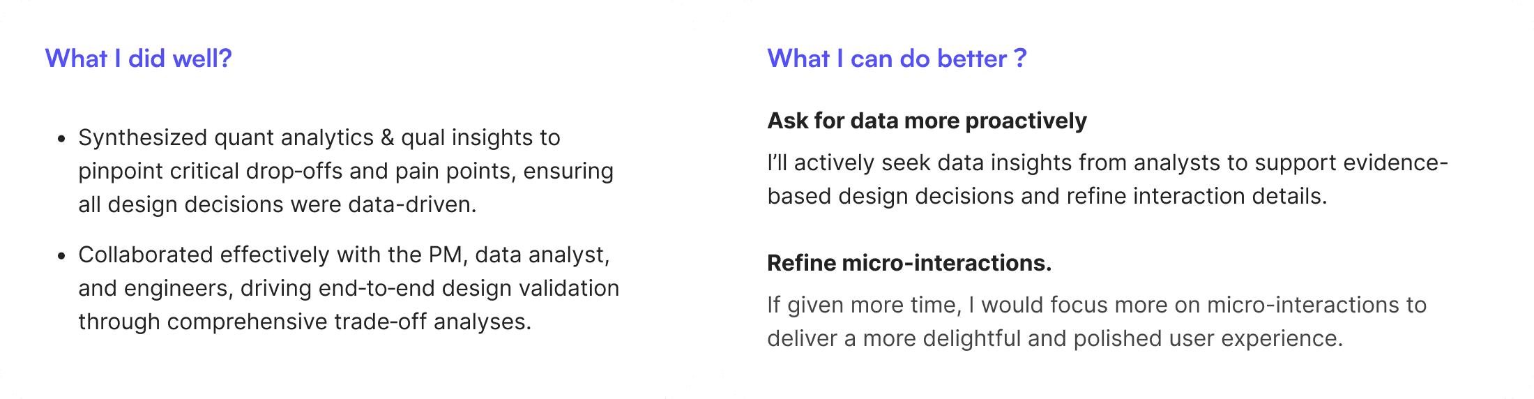
What I did well?
Synthesized quant analytics & qual insights to pinpoint critical drop‑offs and pain points, ensuring all design decisions were data-driven.
Collaborated effectively with the PM, data analyst, and engineers, driving end‑to‑end design validation through comprehensive trade‑off analyses.
What I can do better?
Ask for data more proactively
In future product design work, I’ll be more proactive in asking data analysts for data to better inform decisions and refine details.
Refine micro-interactions.
If given more time, I would focus more on micro-interactions to deliver a more delightful and polished user experience.
Brainstorm Solutions
I facilitated a brainstorming session with the XFN team. For each HMW question, we collaboratively generated 25+ ideas, some inspired by my earlier competitive design analysis, others emerging organically during the session.
We used dot voting to surface top ideas.
H1B Information
Display H-1B sponsor status in job listings and detail pages
Integrate historical H-1B approval metrics (e.g., petition volume and approval rate) into the job detail page
Highlight visa-related contact info for employers with a history of H-1B sponsorship.
Present relevant past H-1B petitions for similar job titles.
Redesign the H-1B filter to improve discoverability and usability.
AI-Powered JD Clarity Enhancements
Add a concise “Job Summary” section to describe key Info in JDs, such as core responsibilities.
Introduce a Skill Map to categorize and clarify key terms in JDs.
Enable tooltips on hover for complex terms with plain-language definitions on hover.
If we have more time...
Resume Scan & AI-Powered Match
Allow users to upload resumes and analyze them against JD skill keywords to identify gaps and generate a match score with clear visual feedback
Provide AI-powered, one-click resume optimization suggestions to help users quickly improve their job fit
MVP Prioritized List
We prioritized top ideas using five criteria: impact, feasibility, ROI, Cherry-pick, and timing.
Feedback-Driven Iteration
After completing the V1.0 design and initial prototype, I shared it with my PM and internal testers to gather feedback. Their feedback surfaced several usability concerns around H-1B info accuracy, tooltip discoverability, and layout hierarchy, which I addressed in the V2.0 redesign.
1. H-1B Info & AI Job Summary
2. Hover-Triggered Popovers for Complex Terms
Design Research on Prob 1 - Term Visibility
To address problem 1, I led design research to compare different trigger mechanisms for glossary terms and mapped a spectrum—from passive tooltips to active highlights (e.g., underlined terms like in Wikipedia).
A later test showed a 43% increase in feature adoption, as more users noticed and interacted with glossary terms.
User Testing
I conducted usability testing with 42 participants — 19 internal stakeholders and 22 trusted testers, both in-person and virtually.
They were split into two groups:
Group A used the original website
Group B used the redesigned prototype
Both groups browsed job listings and decided whether to apply based on their own judgment. I observed user behavior, tracked key metrics, and collected post-task feedback. The redesigned prototype showed clear improvements in average time on page and application conversion rate.
In Group B, over half of the participants actively used new features such as the H-1B information card and AI-generated job summary. Many noted that these features made it easier to quickly assess whether a role was worth applying to, helping explain the increase in application conversion.
Impact
Key metrics after partial feature release:
Testimonials
Yijun Zhang
Madison, WI, U.S.
Super Helpful for International Students!
“I’ve always found it tricky to tell which jobs actually sponsor H-1B as an F-1 student. This made it much easier—I could quickly scan roles and filter out the ones that weren’t a fit. Saved me a ton of time.”
Jessica Lee
San Jose, CA, U.S.
Clearer Visa Info at a Glance
“I really like how it shows both the H-1B tag and petition history for job titles. Most job boards don’t go into that kind of detail. It helped me focus on the ones worth applying to.”
Daniel Rivera
London, UK
Visa Contact is a Nice Touch
“Most jobs don’t say up front if they sponsor, so having someone I could contact directly was super helpful. It made things feel a lot less confusing.”
Rohan Mehta
Bengaluru, India
Quick Skill Check Saves Time
“I liked how the JD summary pulled out the must-have skills up front. It helped me figure out in seconds whether it was worth applying or not.”