


Bitbo - Bitcoin Stats & Data
A fourth-generation, family owned and operated green powered neighborhood market
UX Design
Visual Design
Interaction Design
Design System
B2C
User Research
Mobile Design
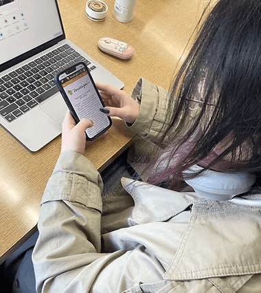
Summary: This case study is a graduate project for the Master of the User Experience class at the University of Wisconsin-Madison. This study's primary goal was to redesign Metcalfe’s app, which encourages quick purchases.
Tools: Figma, Procreate, Google Doc
My Role: UX Research, UX Design
Timeline:

I interviewed 3 Metcalfe's market customers and conducted 3 contextual inquiries that asked them to think aloud when they use the app, I defined our user pain points as follows:
Misaligned feature prioritization, such as users struggling to locate the shopping button.
Cluttered navigation structure, leading to decreased shopping efficiency.
Coarse product categorization, making it difficult to find desired items, such as discounts and hot sales.
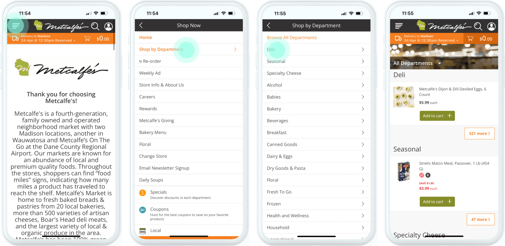
Direct replication from the web version, with a UI design that doesn't adhere to mobile app design principles.
Participant 1

Participant 2

I redefined three typical task flows using brainstormed solutions as followed on Metcalfe's App:
New user use the App to select product
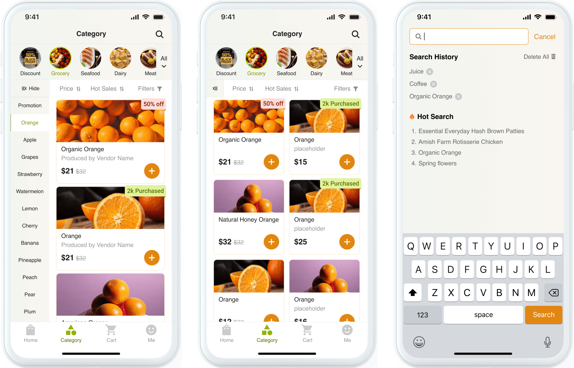
Enhance the navigation hierarchy in Category page by evolving the existing top-level menu categories into a two-tiered menu structure
Add location authorization request instead of enforcing filling in location before user browse products.
Login/Register
After user tap "check-out", then jump to register instead of enforcing register when they first use the app, to keep from user loss.
Search for a certain product
use clear structured search function to find a product, adding search history and hot search recommendation.

Screen Design
I updated the primary color of the previous Metcalfe’s Market website from dark green to bright orange to promote faster purchasing decisions among users, minimizing second thoughts. Additionally, I retained green as a secondary color to symbolize eco-friendliness, aligning with Metcalfe's unique selling proposition of green power.


Design System
When participants test my paper prototype and wireframes, they met some problems, such as, confused about difference between Shop and Category, hope to find more cleared labels of discounts, which were used as good reference for following iterations. And one participant even asked me could he choose delivery way when check out all the products in cart instead of select it every time he add a product in his cart.

Paper Prototype

New user open the app and browse the category

Add a product to cart and check out
When participants test my paper prototype and wireframes, they met some problems, such as, confused about difference between Shop and Category, hope to find more cleared labels of discounts, which were used as good reference for following iterations. And one participant even asked me could he choose delivery way when check out all the products in cart instead of select it every time he add a product in his cart.


The previous screen for opening the app for the first time
Request permission for location instead of insisting users input their location prior to browsing goods

🙅 Pain Point
Misaligned feature prioritization, such as users struggling to locate the shopping button.
Cluttered navigation structure, leading to decreased shopping efficiency.
New user open the app and browse the product category

Redesign
Location Authorization: Instead of forcing users to fill in their location manually before browsing, the redesigned interface introduces an automatic location authorization request. This reduces unnecessary steps, allowing users to browse products directly, enhancing convenience and usability.
Shortened steps for purchasing: The new interface simplifies the process by shortening the steps required to purchase products. Key features, like location settings and product categories, are streamlined and more accessible, improving the shopping flow.

Redesign

This redesign includes structured two-tiered menus to differentiate different brands of the same product while providing hide function for those who prefer a broad product list
A streamlined search function, providing references for users such as search history and hot search.
Add a product to cart and check out

Move the information fill-in and login process after the user taps the "check-out" button to keep from user loss.
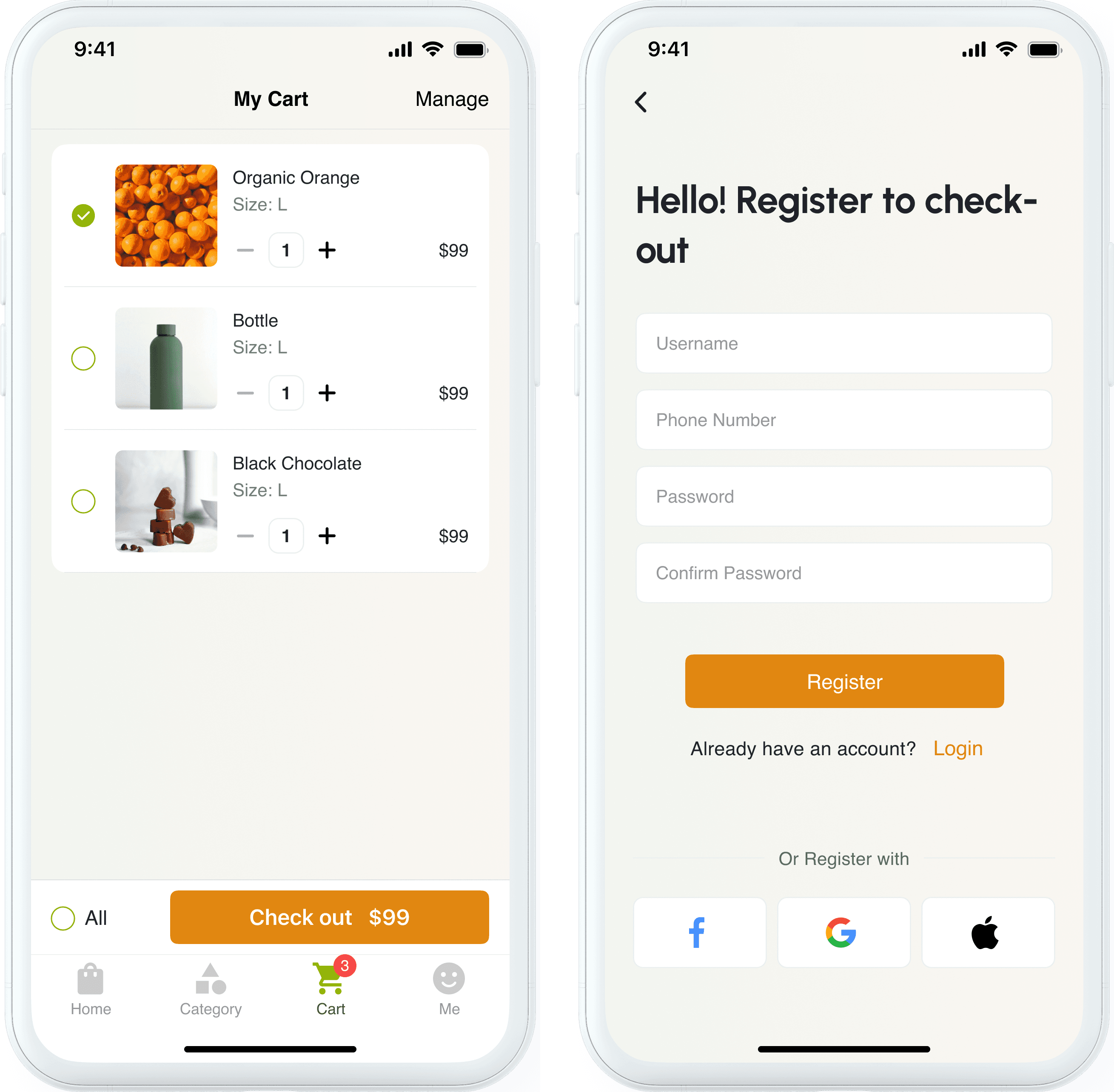
Add a product to cart and check out
Shorten Happy Paths - Simplified task flows & Decreased interaction steps


Interactive Mockups
Lessons Learned
Iterative Design Testing - Continuous testing and responsive updates are essential in the design process. This iterative approach often leads to deviations from the initial concept, illustrating the dynamic and adaptive nature of UX design.
Business Needs vs. User Experience - App design compromises, influenced by business strategies or constraints, can sometimes prioritize commercial interests over optimal user experience.
Feedback Analysis - It’s important to determine whether feedback indicates common user issues or individual preferences, guiding priority for impactful design changes.