
Menu
Menu
SPD Bank’s VTM System Redesign
SPD Bank’s VTM System Redesign
SPD Bank’s VTM System Redesign


Summary
Summary
Led the Video Teller Machine (VTM) platform redesign across two key initiatives: optimizing user flows and information architecture for Investment Center module, and enhancing accessibility through a senior-friendly Comfort Mode. In parallel, built and scaled unified design systems to improve consistency, streamline cross-functional collaboration, and support long-term product growth.
Led the Video Teller Machine (VTM) platform redesign across two key initiatives: optimizing user flows and information architecture for Investment Center module, and enhancing accessibility through a senior-friendly Comfort Mode. In parallel, built and scaled unified design systems to improve consistency, streamline cross-functional collaboration, and support long-term product growth.
+22.3%
user adoption
>1M
Transactions
>100k/mo
The elderly Served
Patent Filed
Comfort mode
+22.3%
user adoption
>1M
Transactions
>100k/mo
The elderly Served
Patent Filed
Comfort mode
Client
SPD Bank
SPD Bank
Role
Lead UX UI designer
co-User researcher
Lead UX UI designer
co-User researcher
Timeline
6/2022 - 10/2022
6/2022 - 10/2022
Tools
Sketch, figma, Principle, Protopie
Sketch, figma, Principle, Protopie
Team
2 PMs, 3 UX designers, 4 Engineering teams
2 PMs, 3 UX designers, 4 Engineering teams
Summary
Led the Video Teller Machine (VTM) platform redesign across two key initiatives: optimizing user flows and information architecture for Investment Center module, and enhancing accessibility through an senior-friendly Comfort Mode. In parallel, built and scaled unified design systems to improve consistency, streamline cross-functional collaboration, and support long-term product growth.
+22.3%
user adoption
>1M
Transactions
>100k/mo
The elderly Served
Patent Filed
Comfort mode
Client
SPD Bank
Role
Lead UX UI designer
co-User researcher
Timeline
6/2022 - 10/2022
Tools
Sketch, figma, Principle, Protopie
Team
2 PMs, 3 UX designers, 4 Engineering teams
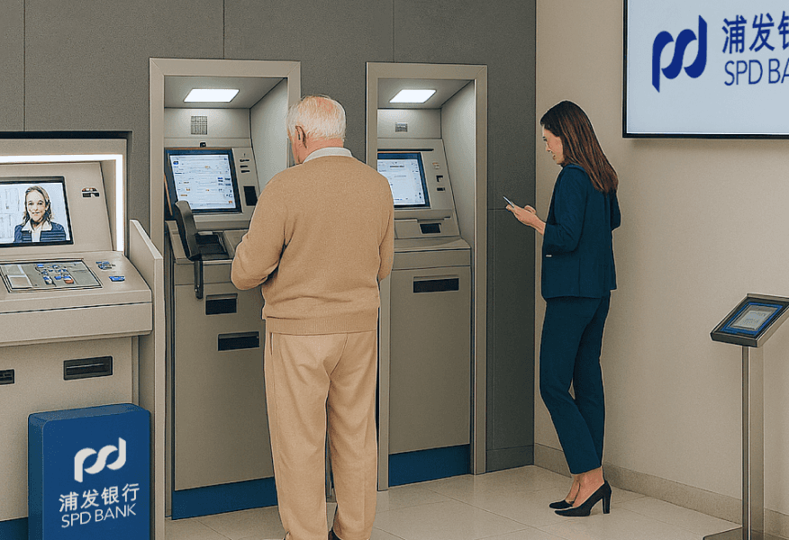
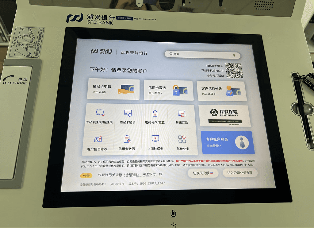
What is VTM?
What is VTM?
VTM (Virtual Teller Machine) is an intelligent self-service terminal that leverages remote support from customer service centers to deliver a wide range of non-cash banking services, including account opening, fund transfers, card issuance, bill payments, loan applications, and investment transactions.
VTM (Virtual Teller Machine) is an intelligent self-service terminal that leverages remote support from customer service centers to deliver a wide range of non-cash banking services, including account opening, fund transfers, card issuance, bill payments, loan applications, and investment transactions.
Product Context & Design History
Product Context & Design History

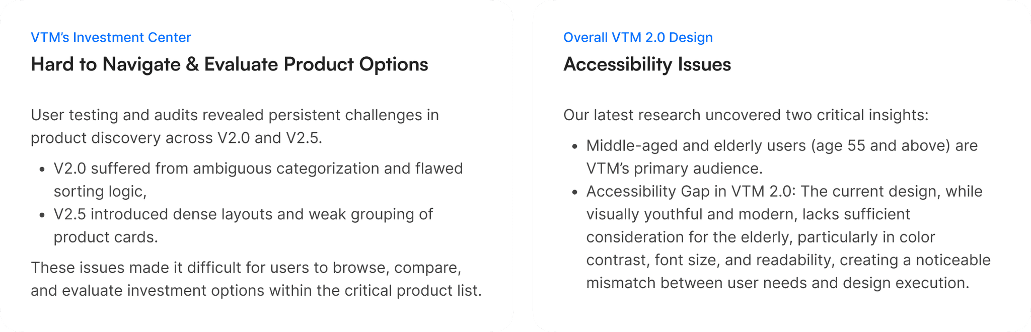
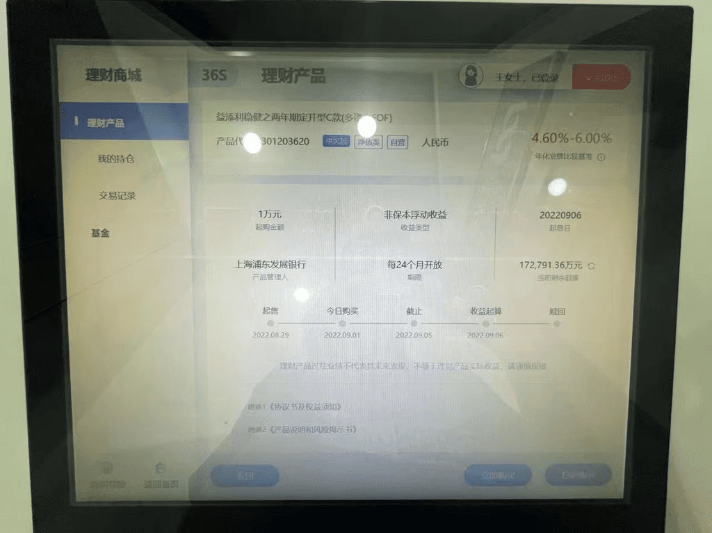
Design QA & 2.0 Design Issues
Design QA & 2.0 Design Issues
After being appointed as the lead designer for the VTM system, I audited the V2.5 build to assess its alignment with the V2.0 design specs. During the audit, I identified logic issues in the original V2.0 design and synthesized engineering feedback into key problem areas.
After being appointed as the lead designer for the VTM system, I audited the V2.5 build to assess its alignment with the V2.0 design specs. During the audit, I identified logic issues in the original V2.0 design and synthesized engineering feedback into key problem areas.
Identified 2.0 Design Issues

Initial Redesign Approval
Initial Redesign Approval
To validate the issues identified in the design audit and engineering feedback, I initiated several rounds of rapid user testing. The results validated several key issues and highlighted their impact on usability and backend logic.
Building on those insights, I collaborated with business stakeholders to gather functional requirements and align on key constraints. I then proposed a redesign plan focused on restructuring the Investment Center’s information architecture and shifting the navigation from vertical to horizontal. The proposal was approved, paving the way for a full redesign.


Research Methods & Goals
Research Methods & Goals
To validate whether the initial redesign approach addressed real user pain points, and to collect user feedback on the newly introduced light-themed UI style, we collaborated with business teams to conduct in-depth user research on the older VTM platform (version 2.5). This mixed-method study included 221 questionnaire responses, interviews with 8 lobby managers, and 15 contextual inquiries with end users.
To validate whether the initial redesign approach addressed real user pain points, and to collect user feedback on the newly introduced light-themed UI style, we collaborated with business teams to conduct in-depth user research on the older VTM platform (version 2.5). This mixed-method study included 221 questionnaire responses, interviews with 8 lobby managers, and 15 contextual inquiries with end users.
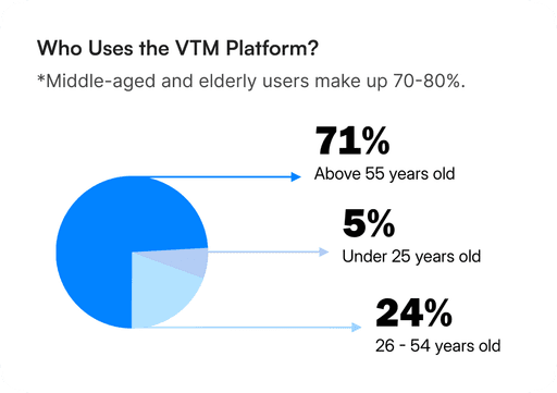
User Landscape Overview
User Landscape Overview

Investment Center
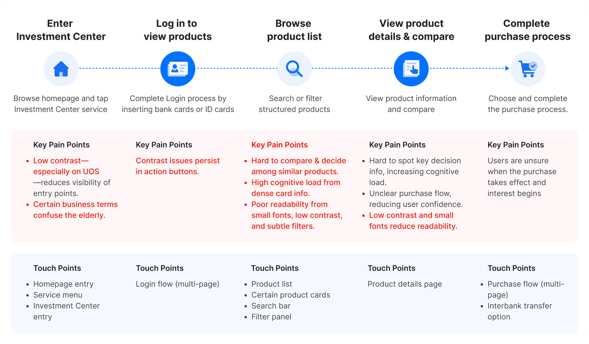
User Journey Map
User Journey Map
General Users vs. Seniors
Age-Related UX Challenges
Age-Related UX Challenges


Re-calibration & User Insights
Re-calibration & User Insights
HMW Statement
HMW Statement
Building on the recalibrated pain points, I framed two How Might We (HMW) statements to guide ideation for each group.
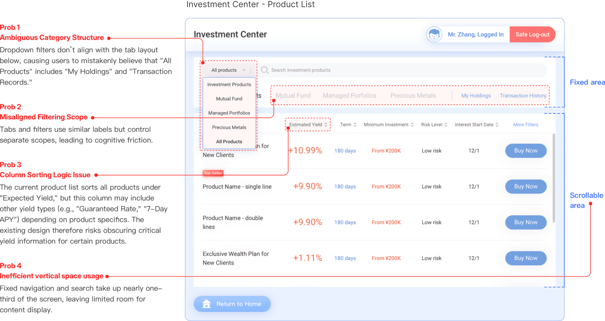
Investment Center - Product List Issues
Investment Center - Product List Issues
Investment Center - Product List Issues
How might we restructure the product list to clarify categorization and reduce cognitive friction during comparison and decision-making?
How might we restructure the product list to clarify categorization and reduce cognitive friction during comparison and decision-making?
How might we restructure the product list to clarify categorization and reduce cognitive friction during comparison and decision-making?
Accessibility Gaps
Accessibility Gaps
Accessibility Gaps
How might we enhance readability and visual clarity to better support elderly users’ interaction confidence?
How might we enhance readability and visual clarity to better support elderly users’ interaction confidence?
How might we enhance readability and visual clarity to better support elderly users’ interaction confidence?


Design Goals & Redesign Scope Overview
Design Goals & Redesign Scope Overview
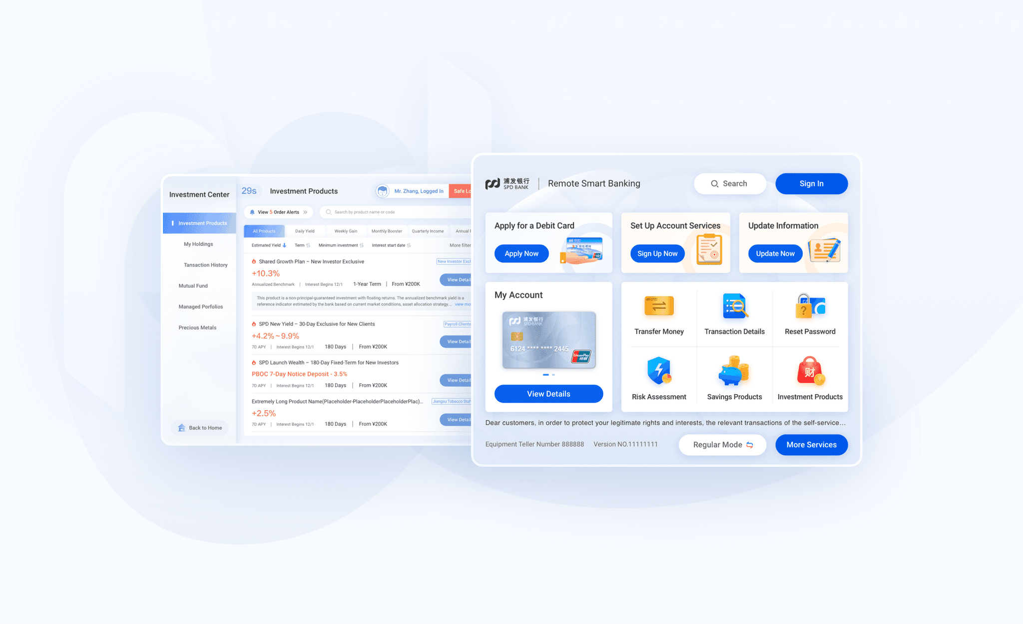
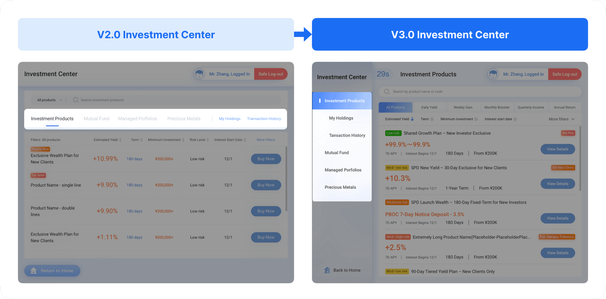
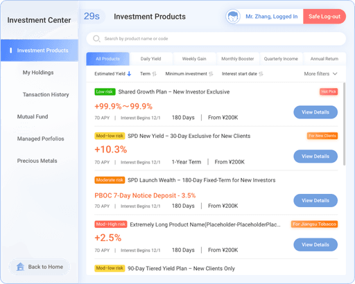
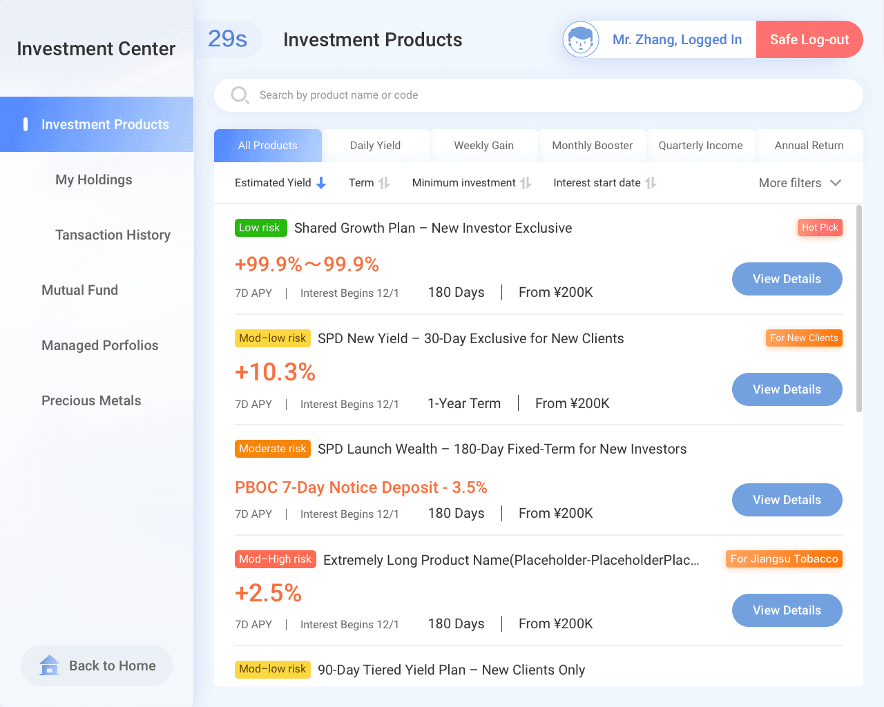
Investment Center Redesign
Investment Center Redesign
Revert vertical navigation to horizontal navigation.
Redesign the IA of the Product List page to improve space efficiency.
Move “My holdings” and “Transaction History” tabs into a sub-menu within each type of product(Investment Products, Mutual Fund...).
Redesign sorting function and product cards to be better aligned with business logic.
Senior-friendly Design
Senior-friendly Design


V3.0 Design
Investment Center Redesign
Investment Center Redesign
Switched to Horizontal Navigation with Improved Menu Structure
Switched to Horizontal Navigation with Improved Menu Structure
Redesigned the main navigation from a vertical layout to a horizontal layout for better use of screen space.
Moved “My Holdings” and “Transaction History” tabs into submenus within each product category(Investment Products, Mutual Funds, Managed Portfolios, and Precious Metals) for a clearer hierarchy.
Layout Exploration: Finalized on Option 2
Layout Exploration: Finalized on Option 2
I explored two layout strategies. Option 1 extended 2.0’s single-row format, showing all product info in one compact line. Option 2 introduced a structured, multi-row card layout with more flexibility for long titles and tags, which we selected as the final direction.
I explored two layout strategies. Option 1 extended 2.0’s single-row format, showing all product info in one compact line. Option 2 introduced a structured, multi-row card layout with more flexibility for long titles and tags, which we selected as the final direction.
Option 1: Compact Single-Line Layout
Option 1: Compact Single-Line Layout
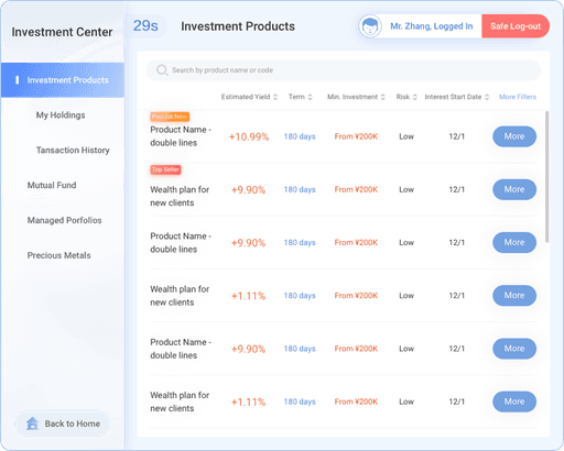
✅ Pros
High density: One-row layout shows more items per screen for faster browsing.
Minimal UI: Fewer elements and tags help goal-driven users focus.
Quick scan: Users can scroll and compare products more efficiently.
❌ Cons
Poor adaptability: Long names or tags may truncate or wrap awkwardly.
Hard to read: Dense columns require memory to interpret.
Not senior-friendly: Small fonts and tight spacing reduce usability.
Option 2: Structured Multi-Line Card Layout
Option 2: Structured Multi-Line Card Layout
✅ Pros
Clearer layout: Split rows improve legibility and reduce cognitive load.
Strong hierarchy: Color-coded tags highlight key info like risk level.
Scalable: Handles long titles and rich content without clutter.
Accessible: Better for first-time or elderly users.
❌ Cons
Heavier visual load: May feel dense due to more info per card.
Lower efficiency: Fewer items visible per screen.
Slightly complex: Requires more design logic to stay balanced.
V3.0 Design
Senior-friendly Design
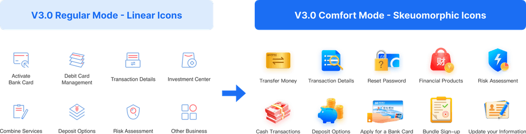
Replace Linear Icons to Skeuomorphic Icons
Replace Linear Icons to Skeuomorphic Icons
I replaced the linear icons from the standard version with skeuomorphic ones. According to some secondary research, skeuomorphic icons are easier for older adults to comprehend and recognize compared to flat designs.
I replaced the linear icons from the standard version with skeuomorphic ones. According to some secondary research, skeuomorphic icons are easier for older adults to comprehend and recognize compared to flat designs.


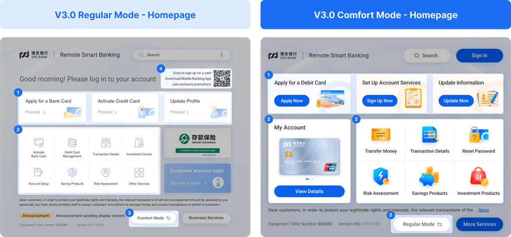
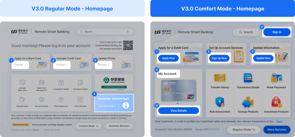
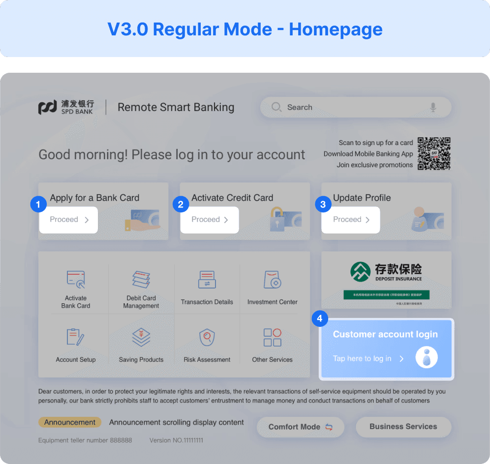
Regular Mode V.S. Comfort Mode
Regular Mode V.S. Comfort Mode
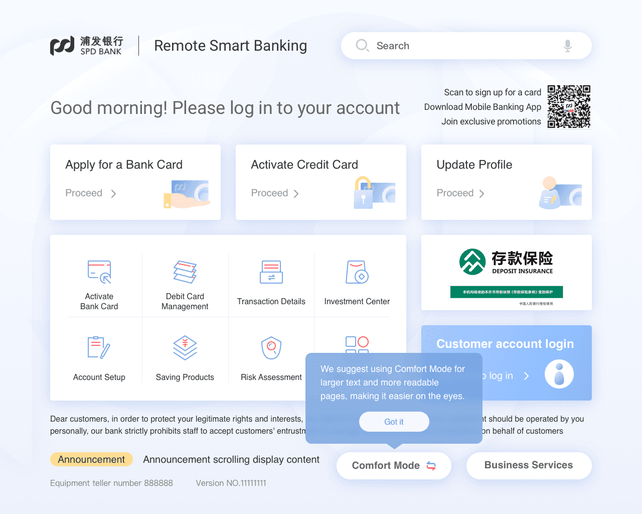
Senior-Friendly Comfort Mode on Homepage
Senior-Friendly Comfort Mode on Homepage
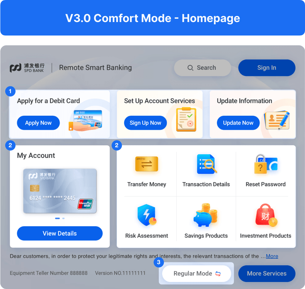

1
Replaced 3 main services based on both business and elderly users’ needs, with usage frequency as a key consideration.
Replaced 3 main services based on both business and elderly users’ needs, with usage frequency as a key consideration.
2
Reduced the number of services in Section 2 from 8 to 6 to save space and minimize visual clutter.
Reduced the number of services in Section 2 from 8 to 6 to save space and minimize visual clutter.
3
Added a “Comfort Mode” entry to the homepage along with a toggle to switch back to Regular Mode. The term “Comfort Mode” was intentionally used to respectfully address older adults, avoiding age-sensitive terms like “old” or “senior.”
Added a “Comfort Mode” entry to the homepage along with a toggle to switch back to Regular Mode. The term “Comfort Mode” was intentionally used to respectfully address older adults, avoiding age-sensitive terms like “old” or “senior.”
4
Removed promotional content to minimize distraction and reduce cognitive load.
Removed promotional content to minimize distraction and reduce cognitive load.
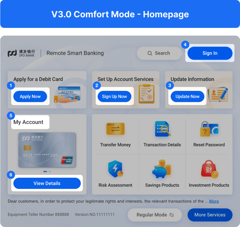
1
2
3
5
Rephrased complex financial terms using plain language, such as renaming “Account Overview” to “My Account”.
Rephrased complex financial terms using plain language, such as renaming “Account Overview” to “My Account”.
1
2
3
4
6
Upgraded text buttons to more visually intuitive styles to improve accessibility.
Upgraded text buttons to more visually intuitive styles to improve accessibility.
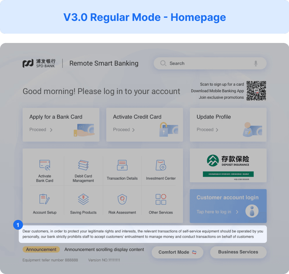
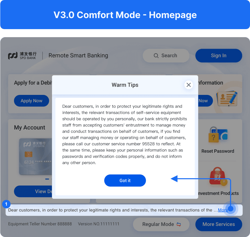
1
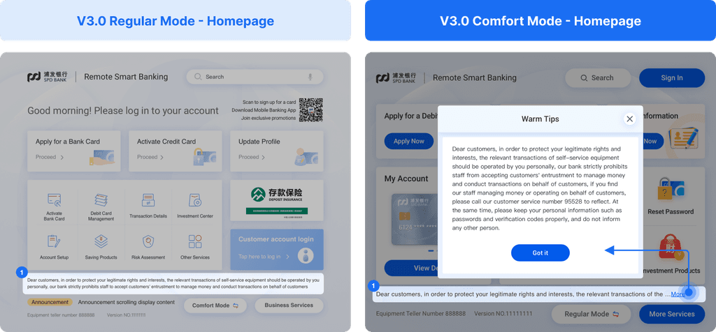
To reduce clutter and save space, the full legally required information is revealed in a pop-up when users tap “More”.
To reduce clutter and save space, the full legally required information is revealed in a pop-up when users tap “More”.
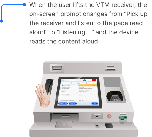
Add Talk-Back Function
Add Talk-Back Function
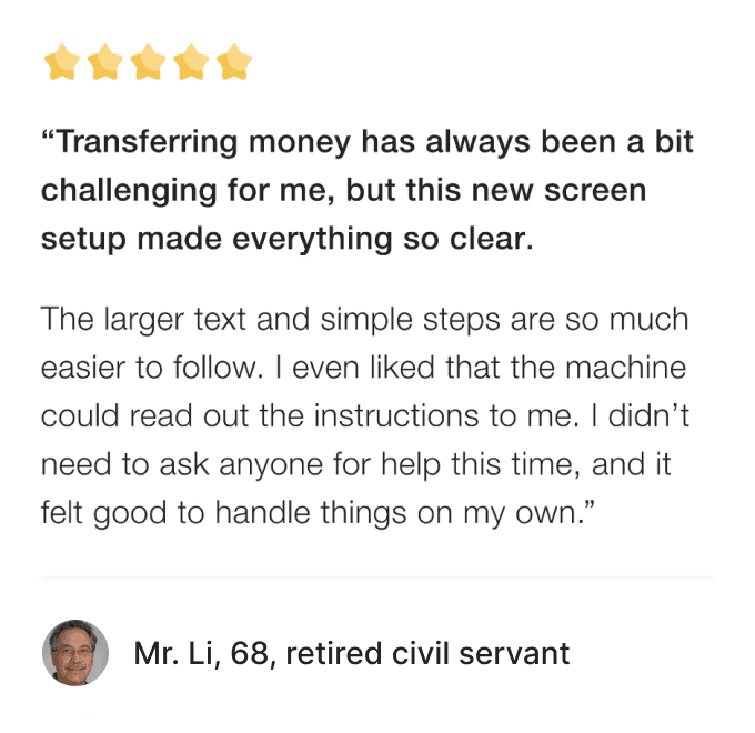
To reduce the visual burden on the elderly and to care for people with visual impairment, we have added a screen reader function to some important business screens.
V3.0 Transfer - Confirmation
Enhanced Debit Card Services with Remote Assistance
Enhanced Debit Card Services with Remote Assistance
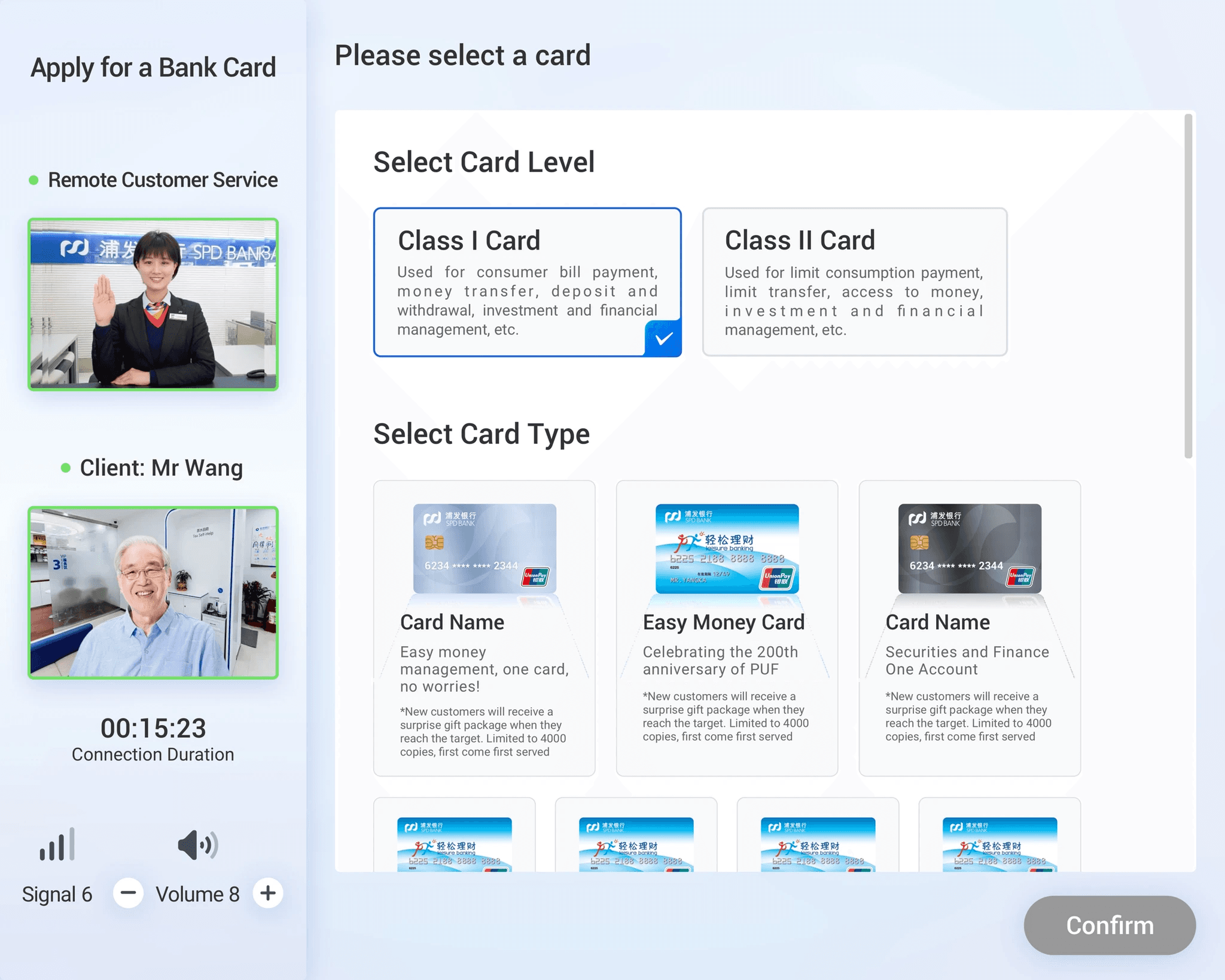
Smart Assist - Apply for a Bank Card
Smart Assist - Apply for a Bank Card
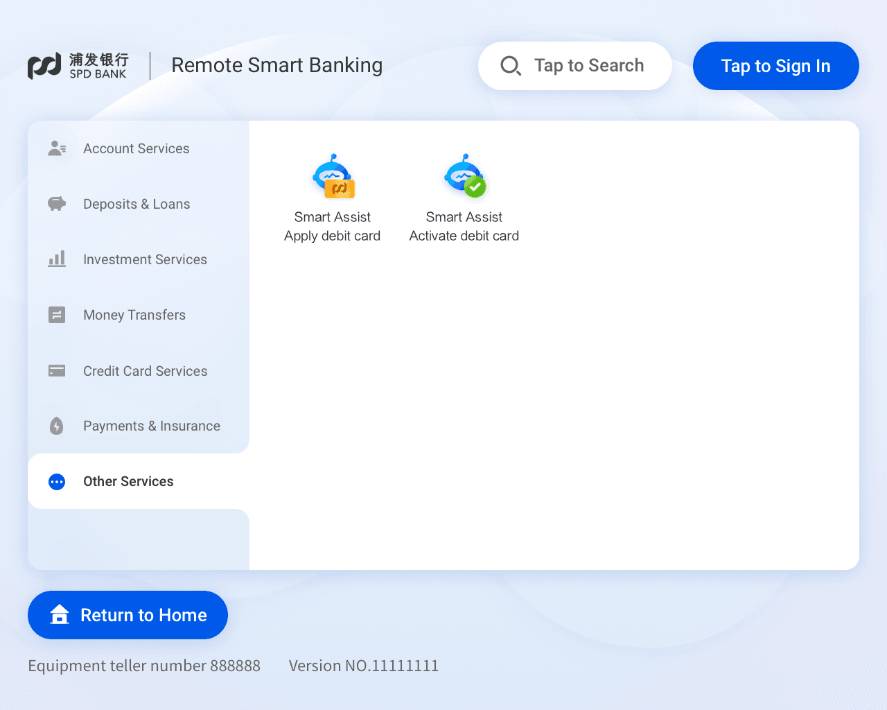
Streamlined Interaction Design Approach for Less Confusion
Streamlined Interaction Design Approach for Less Confusion


Follows standard mobile banking interface logic
Follows standard mobile banking interface logic


Instant feedback and easier interaction for seniors
Instant feedback and easier interaction for seniors


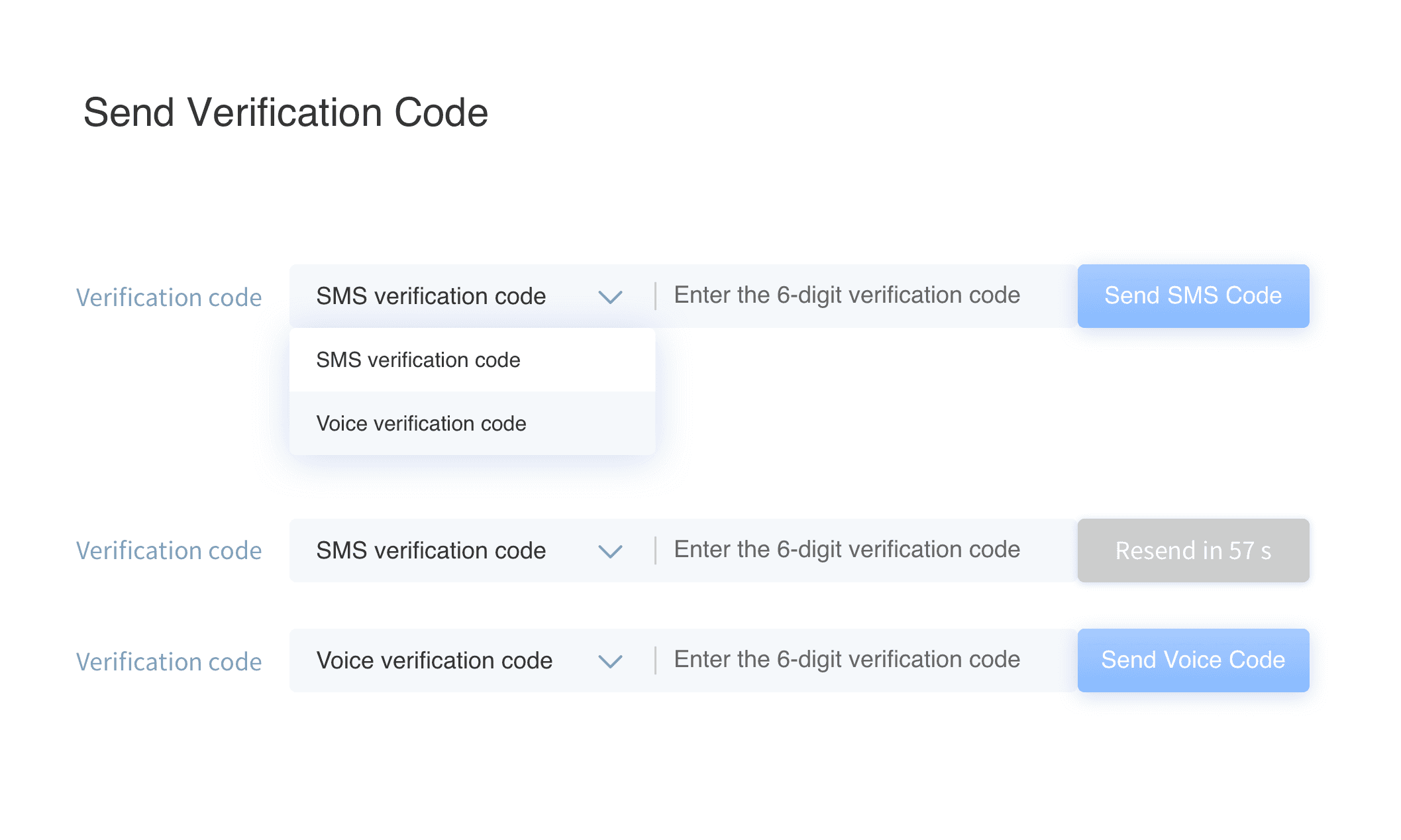
Verification method is hidden in a dropdown. Users must tap to view and select between SMS and voice options.
Verification method is hidden in a dropdown. Users must tap to view and select between SMS and voice options.

Verification method embedded in the interface for direct access, reducing interaction complexity.
Verification method embedded in the interface for direct access, reducing interaction complexity.

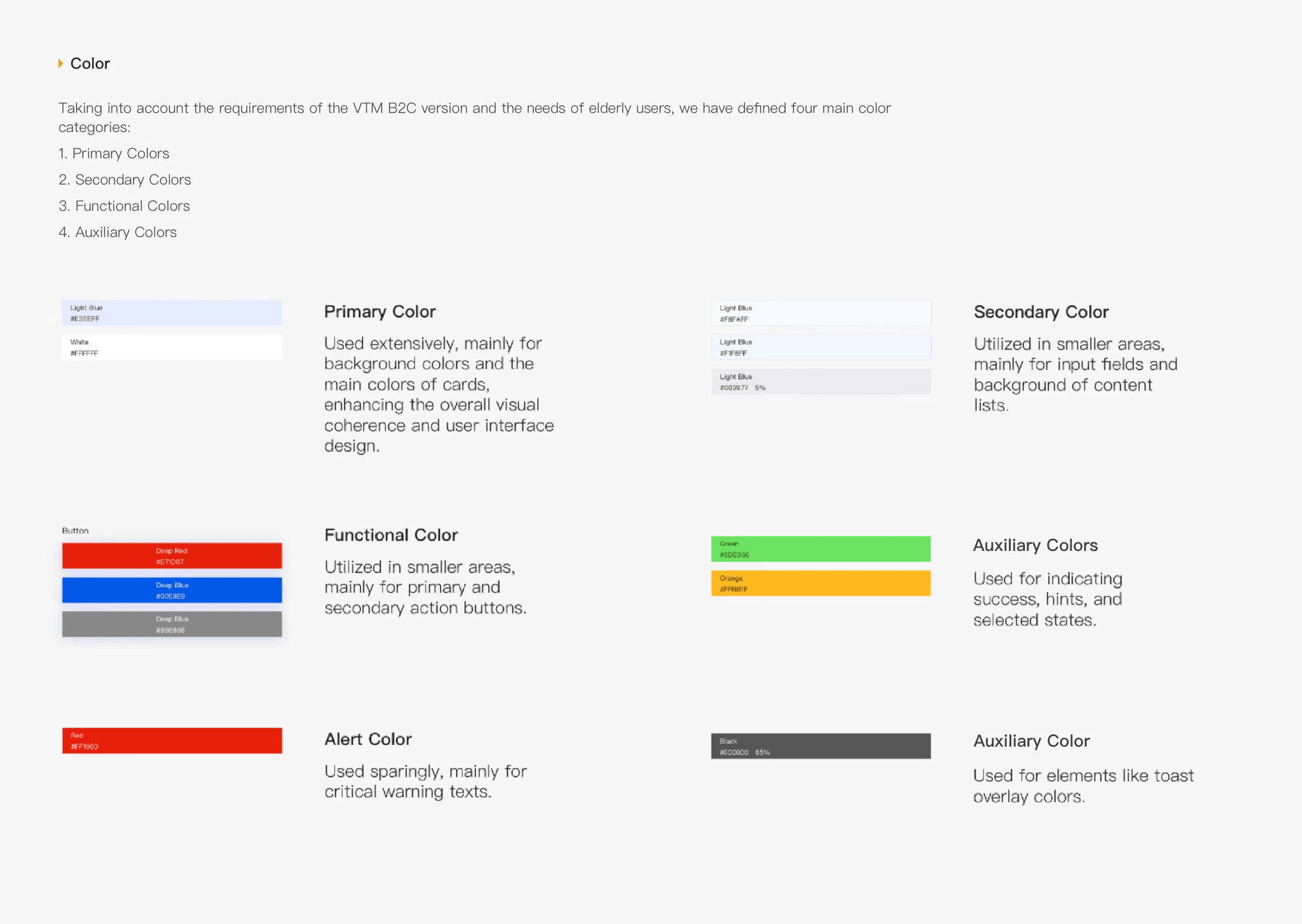
Design system
Tailored Design System & Design Guidelines
Tailored Design System & Design Guidelines
I maintained and expanded the Regular design system and created the Comfort Mode system, enhancing color contrast, font size, and UI components to meet WCAG AA/AAA accessibility standards.
I maintained and expanded the Regular design system and created the Comfort Mode system, enhancing color contrast, font size, and UI components to meet WCAG AA/AAA accessibility standards.
Comfort Mode - Typography(Enlarged Fonts)
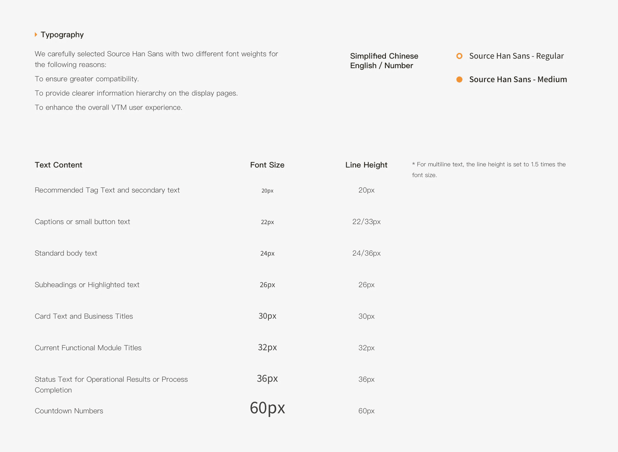
Meets WCAG 2.1 AA/AAA standards
Regular Mode - Color System

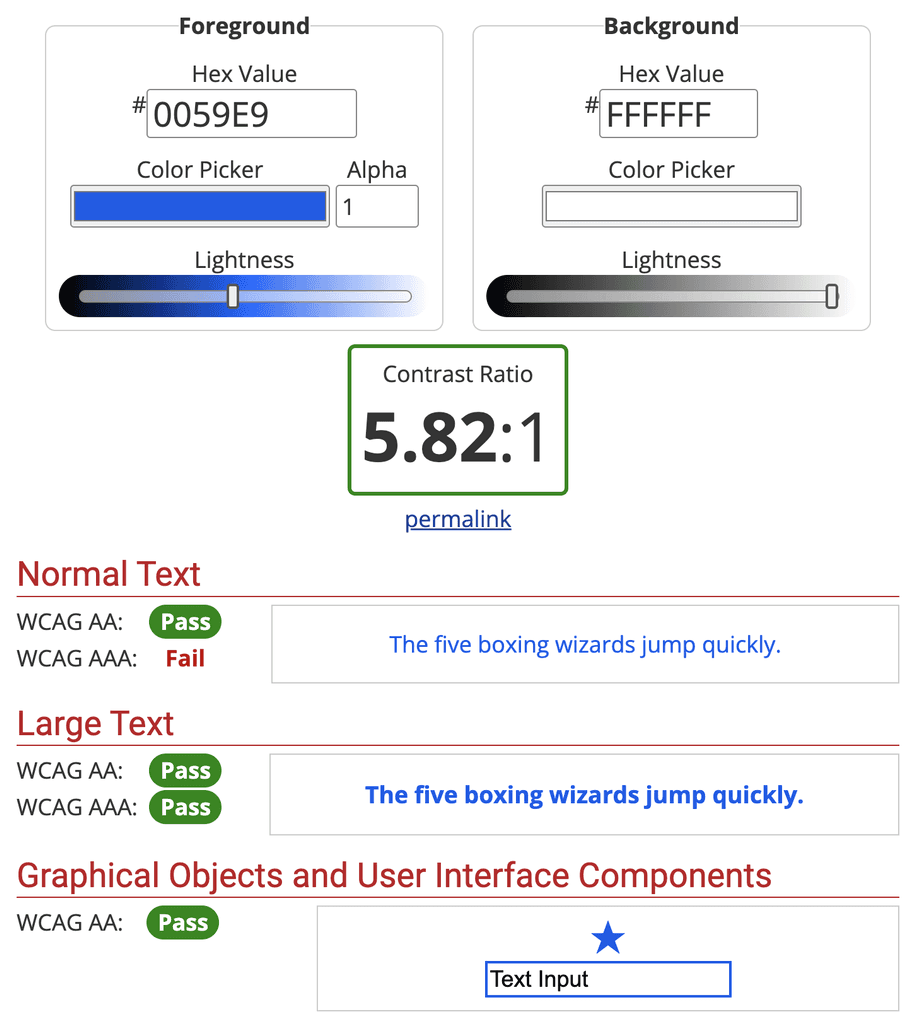
Comfort Mode - Color System (Enhanced Color Contrast)
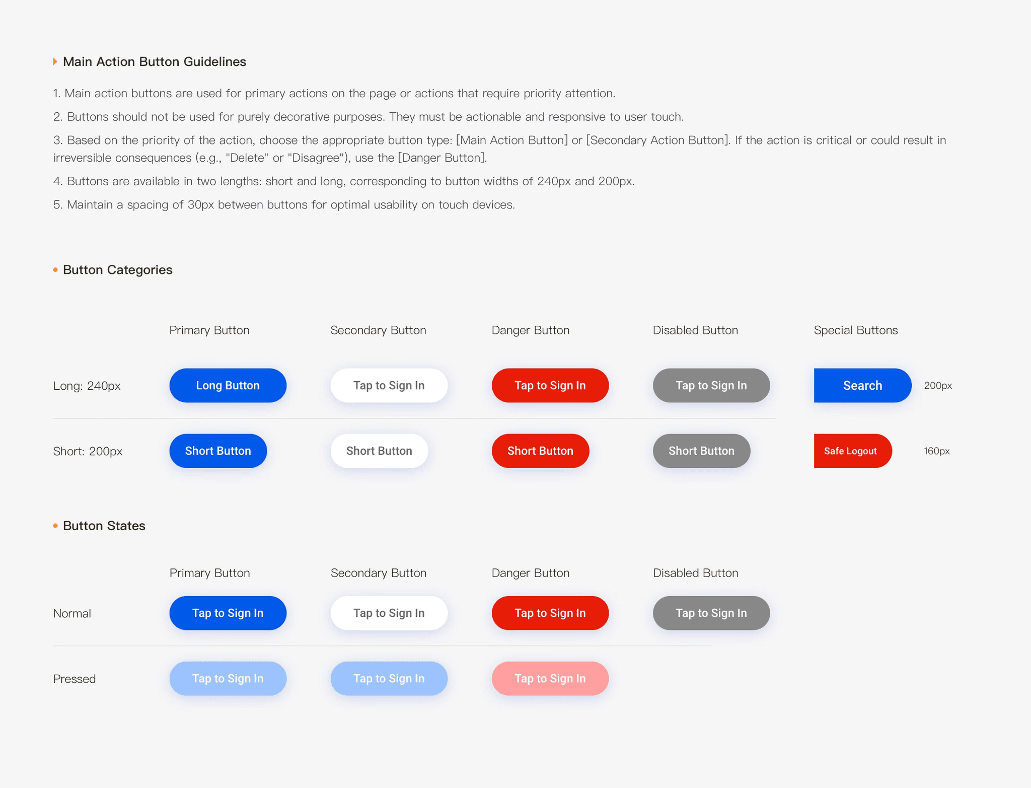
Regular Mode - Buttons

Comfort Mode - Buttons (Larger & More Legible)
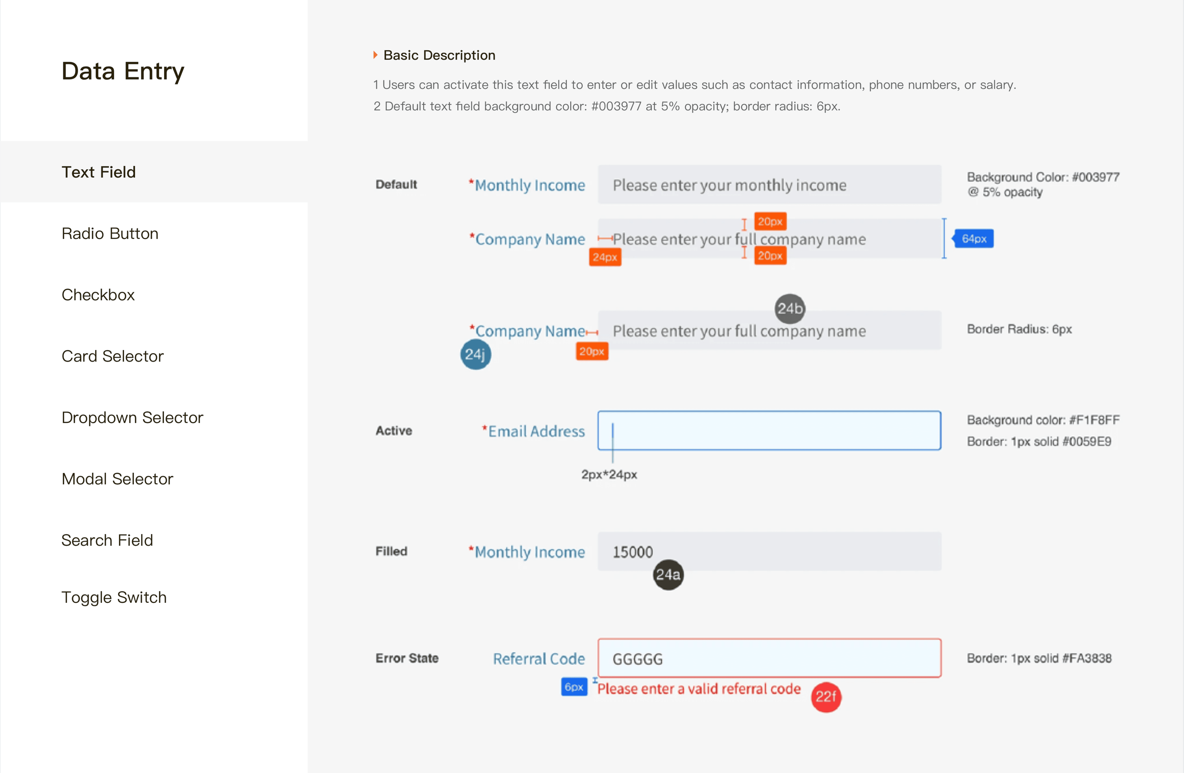
Regular Mode - Input Field
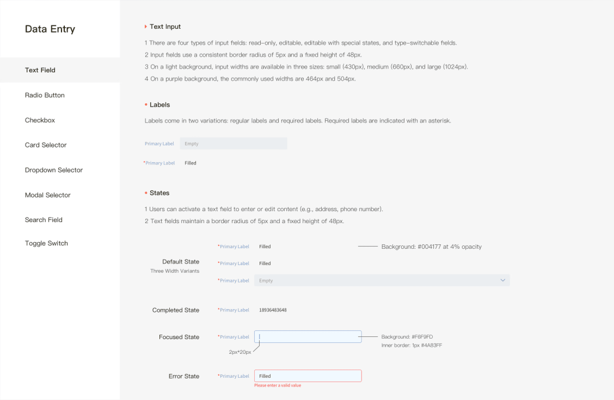
Comfort Mode - Input Field (Larger & More Legible)


First Iteration
Iteration Based on Business Review
Iteration Based on Business Review
Upon we submitting the V3.0 design for business review and conducted 13 coffee studies, we received the following UX-focused feedback:
Remove the “Risk” label from the product list to avoid introducing negative framing that could reduce users’ purchase intent and lower conversion rates. Retain the risk rating only on the product detail page, where users actively seek more detailed information.
Refine visual hierarchy by toning down the visual prominence of colored tags in information-dense layouts, thereby reducing visual noise and cognitive load.
Clarify financial terminology by adding a tooltip to the “Annualized Performance Benchmark” to prevent misinterpretation as a guaranteed return.
Redesign of Investment Center - Product List


Redesign of Investment Center - Product List


Offline Usability Testing
Offline Usability Testing
We collaborated with business stakeholders to conduct offline usability testing with 92 participants — 63 internal stakeholders and 29 trusted testers. We also recorded session videos and documented key findings in usability reports.
We collaborated with business stakeholders to conduct offline usability testing with 92 participants — 63 internal stakeholders and 29 trusted testers. We also recorded session videos and documented key findings in usability reports.
Second Iteration
Usability Issues & Design Iteration
Usability Issues & Design Iteration
Investment Center Redesign
Investment Center Redesign
V3.0 – Iteration 1
V3.0 – Iteration 2
Redesign Consideration
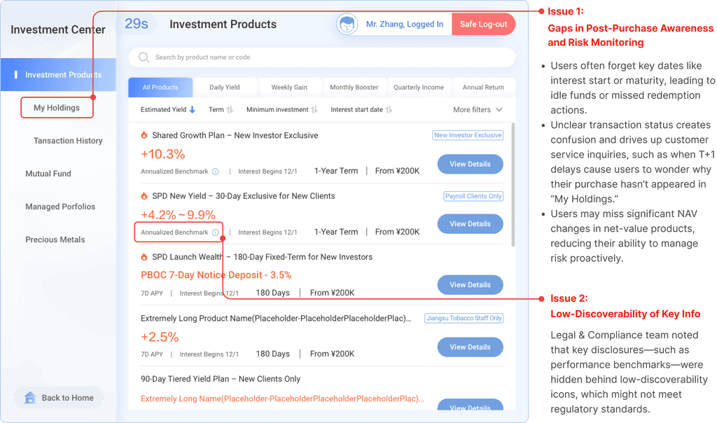
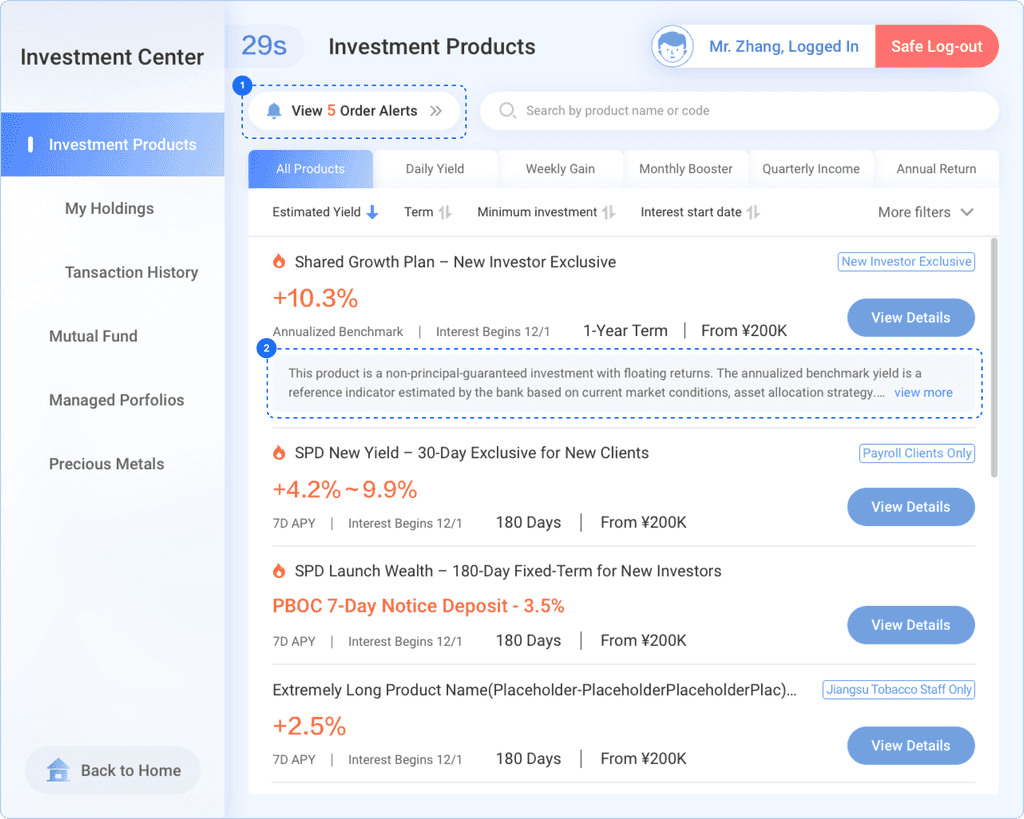
Issue 1 solved: Gaps in post-purchase awareness & risk monitoring
Issue 1 solved: Gaps in post-purchase awareness & risk monitoring
1
Introduced a clickable Product Order Reminder banner to surface recently purchased items and alert users to key product milestones—helping reduce post-purchase uncertainty and missed actions.
Introduced a clickable Product Order Reminder banner to surface recently purchased items and alert users to key product milestones—helping reduce post-purchase uncertainty and missed actions.
Issue 2 solved: Low-discoverability of key Info
Issue 2 solved: Low-discoverability of key Info
2
Replaced tooltip with a persistent inline section to display full performance benchmarks directly within the product card. Long content is truncated with a 'Show more' toggle.
Replaced tooltip with a persistent inline section to display full performance benchmarks directly within the product card. Long content is truncated with a 'Show more' toggle.
Design Trade-offs
While inline benchmarks occupy more vertical space and reduce the number of visible cards above the fold, the team prioritized regulatory compliance and user clarity from a UX perspective in making this trade-off.
While inline benchmarks occupy more vertical space and reduce the number of visible cards above the fold, the team prioritized regulatory compliance and user clarity from a UX perspective in making this trade-off.
Senior-friendly Design
Senior-friendly Design

Issue 1
The Comfort Mode entrance is not obvious and can be easily overlooked.
Design Solution & Iteration
Once elderly customers aged 65 and over successfully log in, the system will automatically switch to the Comfort Mode interface.
Integrate the Comfort Mode recommendation text bubble into the Regular mode.
Issue 2
The lack of clear feedback when switching from "Regular Mode" to "Comfort Mode" makes users uncertain whether the mode switch was successful.

Design Solution & Iteration
We introduced a motion-enhanced icon and popup to confirm when Comfort Mode is activated. These visual cues help users quickly recognize that the switch was successful.

Issue 1
The Comfort Mode entrance is not obvious and can be easily overlooked.

Design Solution & Iteration
Once elderly customers aged 65 and over successfully log in, the system will automatically switch to the Comfort Mode interface.
Integrate the Comfort Mode recommendation text bubble into the Regular mode.
Issue 2
The lack of clear feedback when switching from "Regular Mode" to "Comfort Mode" makes users uncertain whether the mode switch was successful.
Design Solution & Iteration
We introduced a motion-enhanced icon and popup to confirm when Comfort Mode is activated. These visual cues help users quickly recognize that the switch was successful.


Seamless Implementation of Comfort Mode Throughout the VTM Service Journey
Seamless Implementation of Comfort Mode Throughout the VTM Service Journey
Collaborate with business managers and product managers to ensure a cohesive and user-centered end-to-end experience that enhances accessibility and usability for elderly customers.
Collaborate with business managers and product managers to ensure a cohesive and user-centered end-to-end experience that enhances accessibility and usability for elderly customers.
Senior-friendly Design
Senior-friendly Design

Outcomes
Outcomes
Since it launched...
Since it launched...
+22.3%
user adoption
>1M
Transactions
>100k/mo
The elderly Served
Patent Filed
Comfort mode
Significantly enhanced customer satisfaction, which led our team to file a related patent application
Significantly enhanced customer satisfaction, which led our team to file a related patent application
Staff at SPD Bank branches observed a shift in elderly customers’ attitudes toward using VTM. While they previously complained that the service felt cold, complicated, and required too many steps, they now find it faster and more convenient—with no need to wait in line.
Staff at SPD Bank branches observed a shift in elderly customers’ attitudes toward using VTM. While they previously complained that the service felt cold, complicated, and required too many steps, they now find it faster and more convenient—with no need to wait in line.


What I did well?
What I did well?
I avoided defaulting to familiar interaction patterns that worked in our mobile app or VTM regular mode, and instead redesigned the flow in Comfort Mode to reduce steps and better support older users’ needs.
I avoided defaulting to familiar interaction patterns that worked in our mobile app or VTM regular mode, and instead redesigned the flow in Comfort Mode to reduce steps and better support older users’ needs.
What can I do better?
What can I do better?
In a fast-paced project with limited time, I realized I should have involved the tech team earlier. Early collaboration would have allowed them to begin developing foundational components in parallel, improving overall efficiency and reducing delivery risks.
In a fast-paced project with limited time, I realized I should have involved the tech team earlier. Early collaboration would have allowed them to begin developing foundational components in parallel, improving overall efficiency and reducing delivery risks.
Iteration Plan
Iteration Plan
Continue refining and expanding the design system and component libraries for both modes.
Improve remaining usability issues in Regular Mode 2.0.
Continue designing other key services in Comfort Mode based on the Product Requirements Document (PRD).
Continue refining and expanding the design system and component libraries for both modes.
Improve remaining usability issues in Regular Mode 2.0.
Continue designing other key services in Comfort Mode based on the Product Requirements Document (PRD).