


Metcalfe's Market Employees
Metcalfe's Market, a family-owned, green-powered neighborhood market, sought to revamp its mobile app to align with modern mobile design principles and increase conversion rates, identified as key metrics for success.
Problem
Following a heuristic evaluation, 4 usability testings, and 3 stakeholder interviews of Metcalfe's mobile app, three significant issues were uncovered:
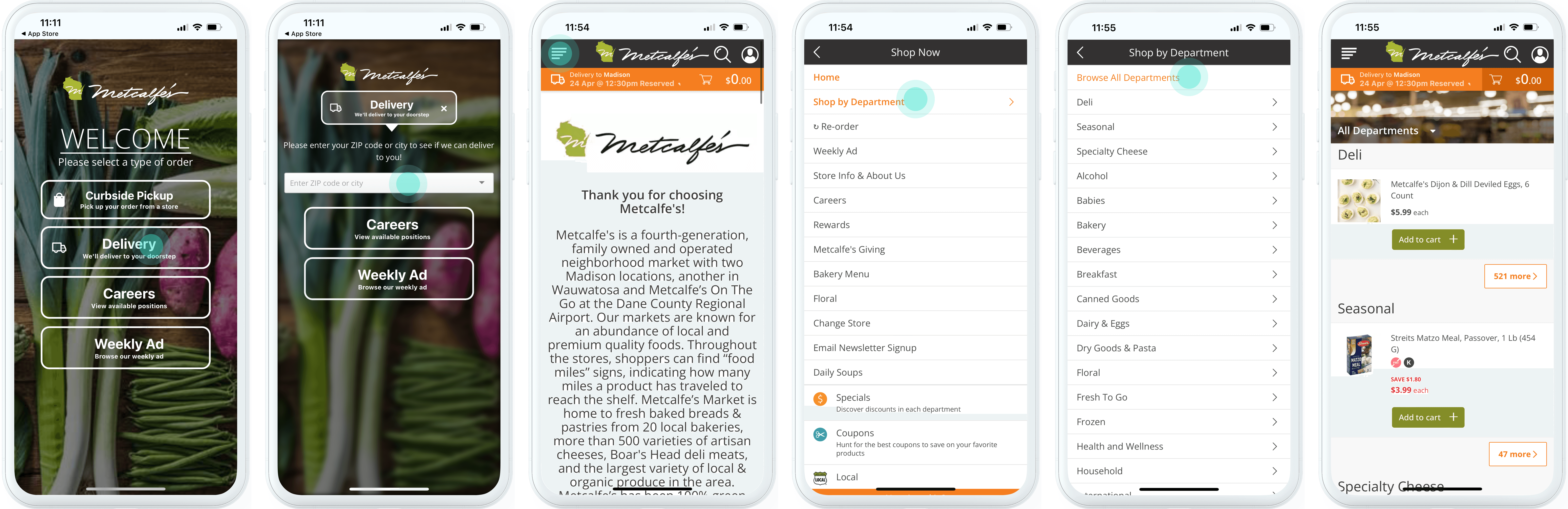
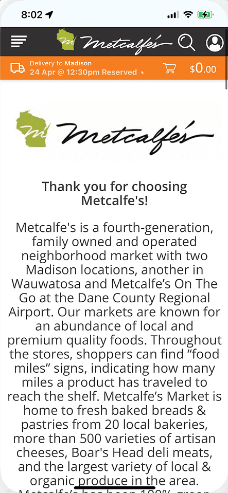
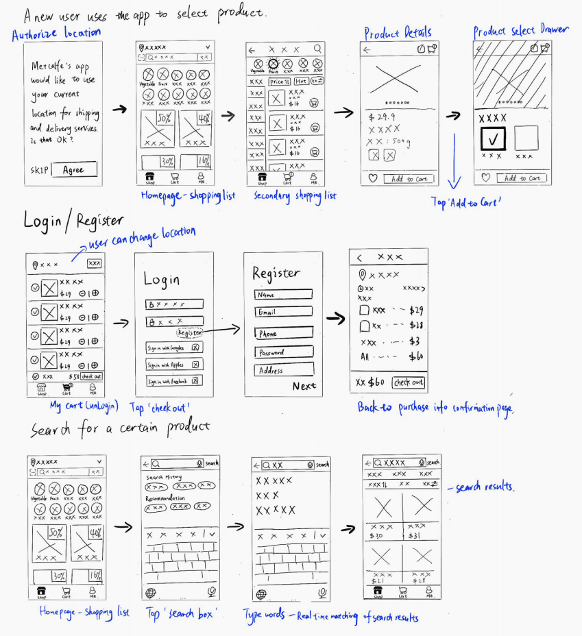
Prior Steps to browse Product List
I. Complex Navigation hinders Quick Purchases
The app's complex navigation obstructs users from quickly locating the product list, which prevents quick purchases.
"Where is the shop button?"
"Wait, where’s the product list? I can’t find it."
II. Non-Optimized Mobile Experience
The app design was a direct replication of the website, with little consideration for mobile-specific interactions. This resulted in a dated interface and failed to meet modern mobile design standards.
“Why isn’t the menu at the bottom like most apps?

Metcalfe's Website & App
Confusing Multiple Promotions
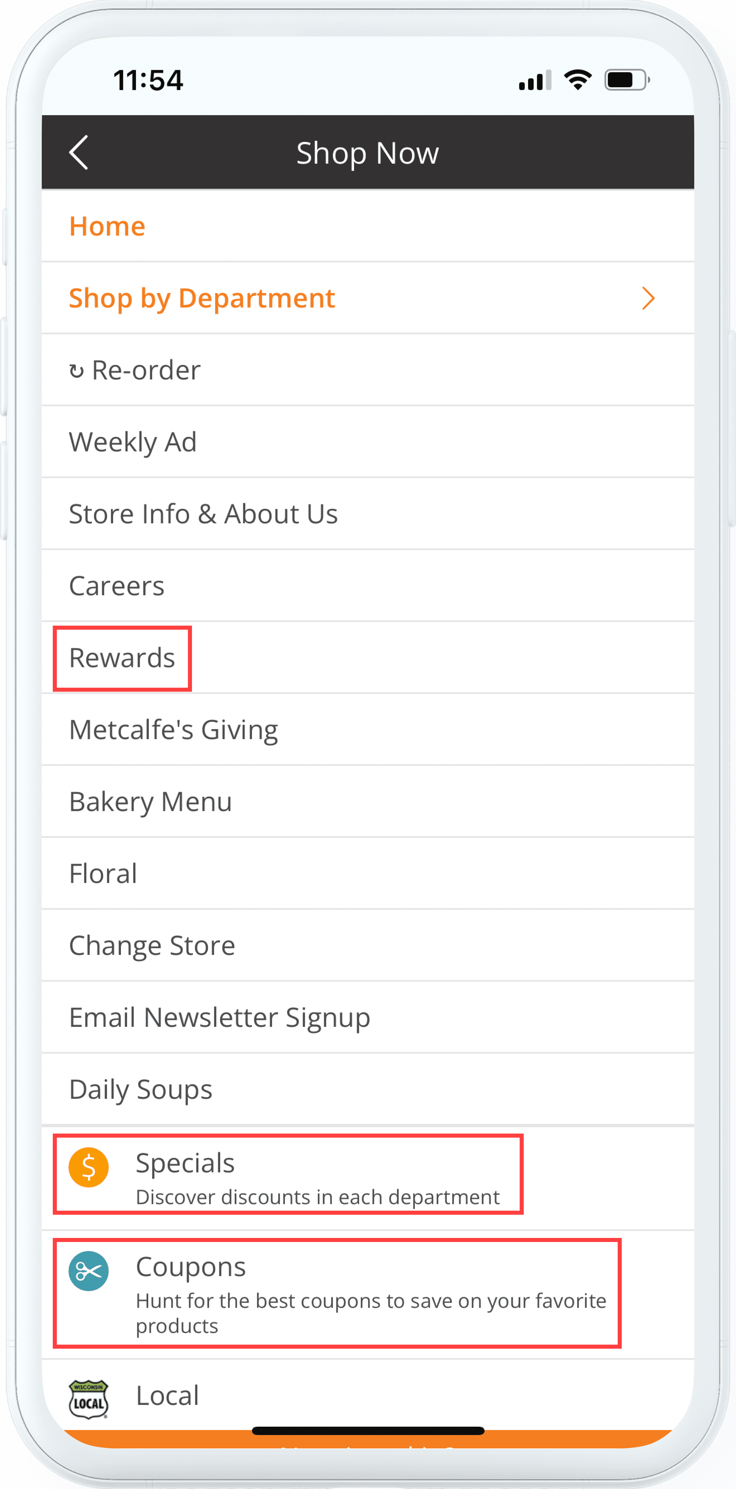
III. Unclear Prioritization and Redundant Categories
Low-priority items clutter the menu, while essential promotions lack clear distinction. Users struggle to quickly identify deals, leading to confusion and friction in the shopping experience.
“So Specials and Coupons… aren’t they the same? Which one’s the better deal?"
In conclusion, these issues hinder navigation, slow down purchases, and reduce conversion rates, highlighting the need for a more streamlined and user-friendly design.
I. Complex Navigation hinders Quick Purchases
II. Non-Optimized Mobile Experience
III. Unclear Prioritization and Redundant Categories
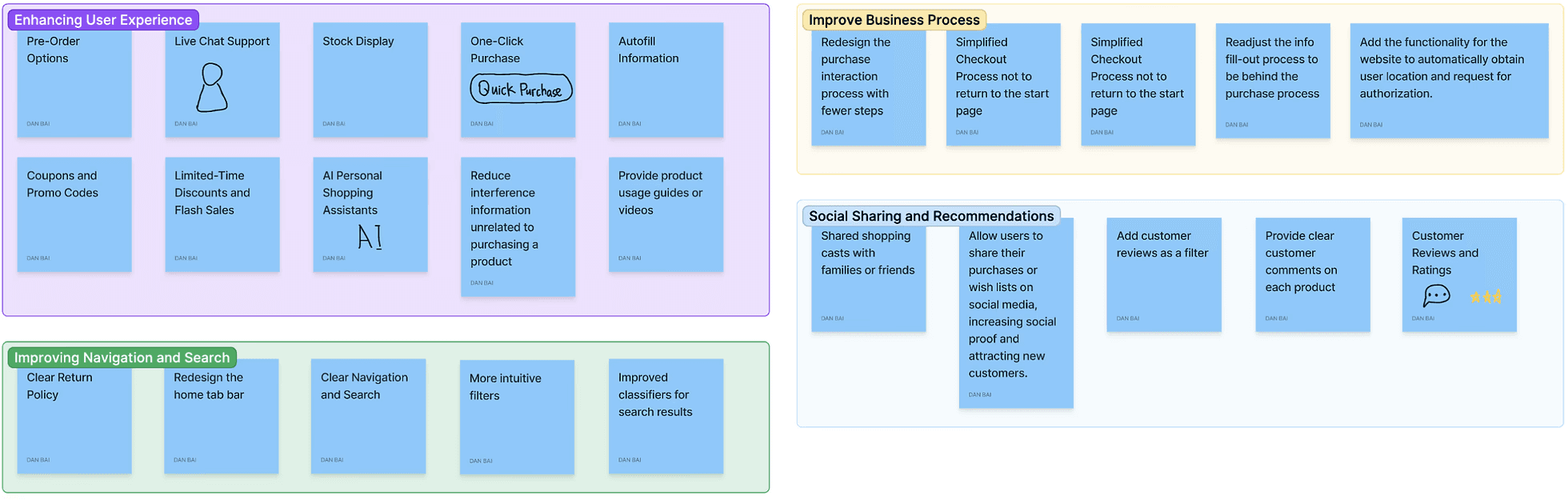
Redesign information architecture
Simplify navigation for intuitive browsing
Align interactions with modern mobile UX best practices.
Highlight promotions and product listings for quicker access
Refine the Shopping Flow to Minimize Friction
Enable automatic location detection to reduce manual input.
Defer personal info entry, like address details, to post-purchase to reduce drop-offs
Based on the card sorts, participants suggested labels reflecting common app functionalities. The new categories were refined as follows:
Shopping – Covers browsing and product selection, aligning with participants' preferences.
About Us – Simplifies “Information” and “Store Info” into a clear, industry-standard label.
My Account/Me – Matches participants’ strong mental model for personal account features.
Delivery Options – Combines “Delivery” and “Pick-up” under a shared order fulfillment label.
Deals – Consolidates “Coupons” and “Rewards” to reflect financial benefits.
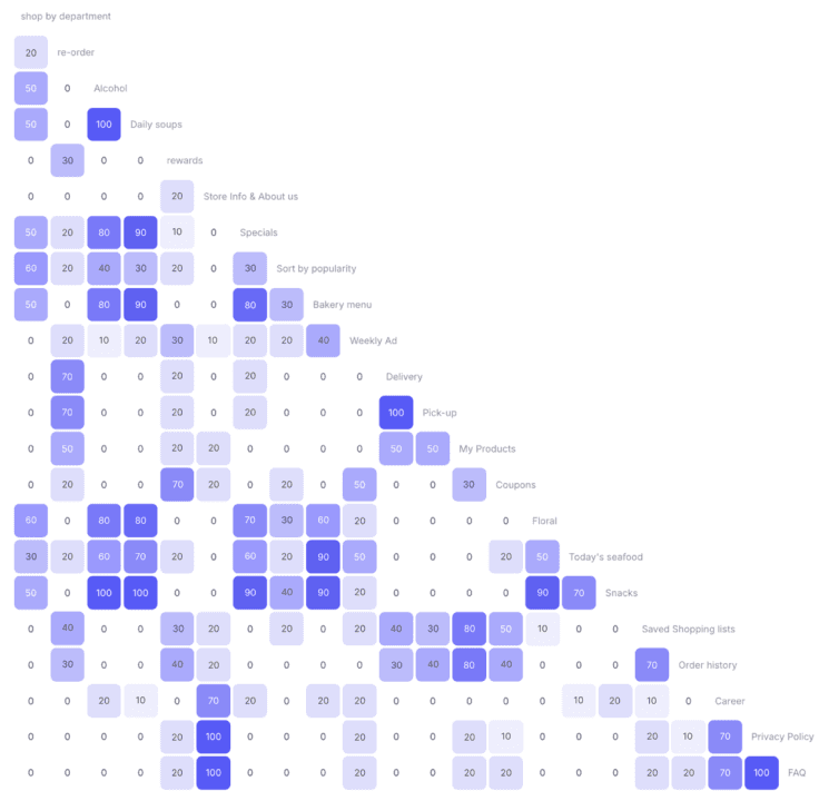
Similarity Matrix
Screen Design
While testing my paper prototype and wireframes, participants encountered several issues, providing valuable insights for future iterations. Key feedbacks includes:
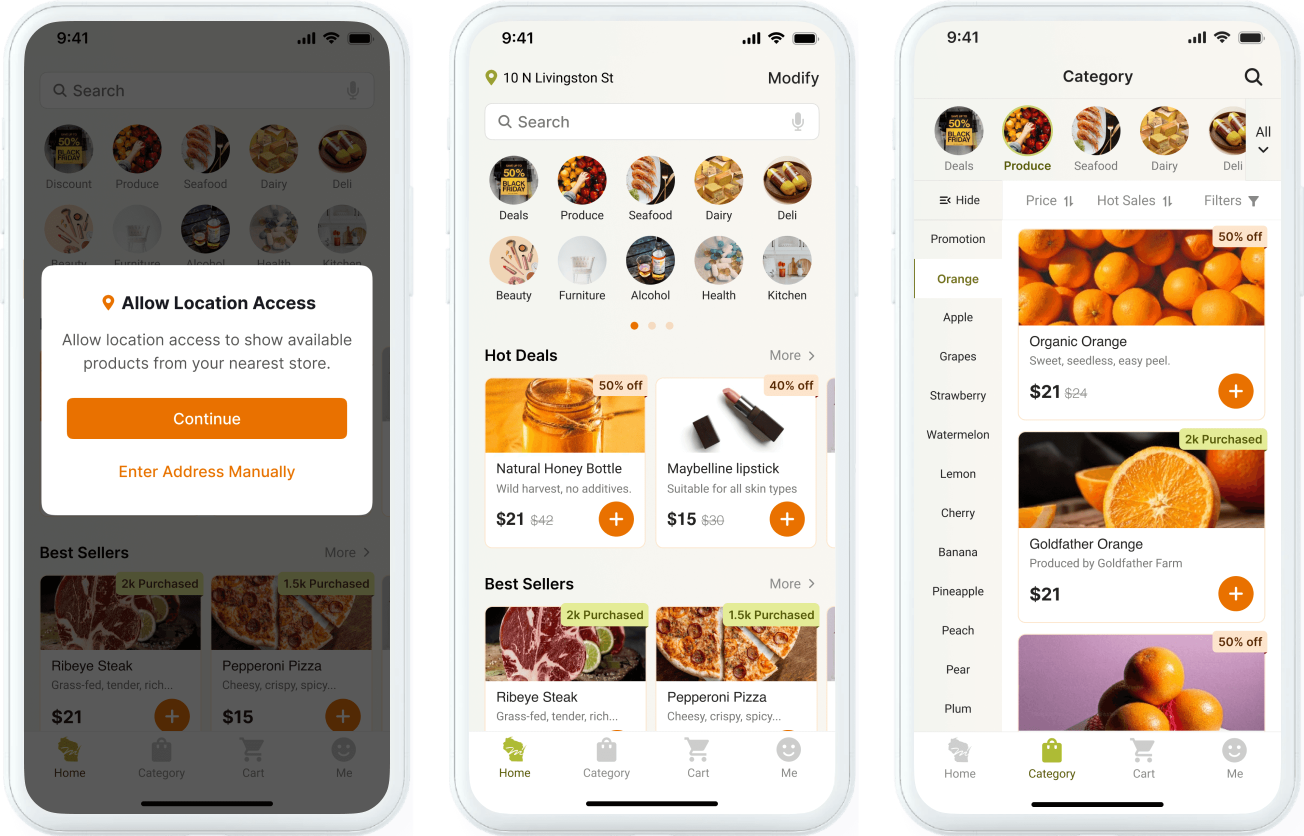
Unclear Discount Labels
Participants expressed the need for clearer labeling of discounts to easily identify promotions.
✅ Solved
Introduce a high-visibility discount category to enhance visual hierarchy and add more affordant discount labels with bold colors and clear signifiers like '50% OFF' to improve discoverability and user engagement.
Delivery Selection Suggestion
One participant suggested allowing users to select a delivery method during checkout for all items in the cart, instead of choosing it individually for each item added.
❌ Not feasible
It does not align with business requirements and user needs. Local regulations and freshness constraints mean that not all items are eligible for delivery. The current design ensures users are informed of any restrictions upfront and avoids unexpected issues at checkout.

Paper Prototype
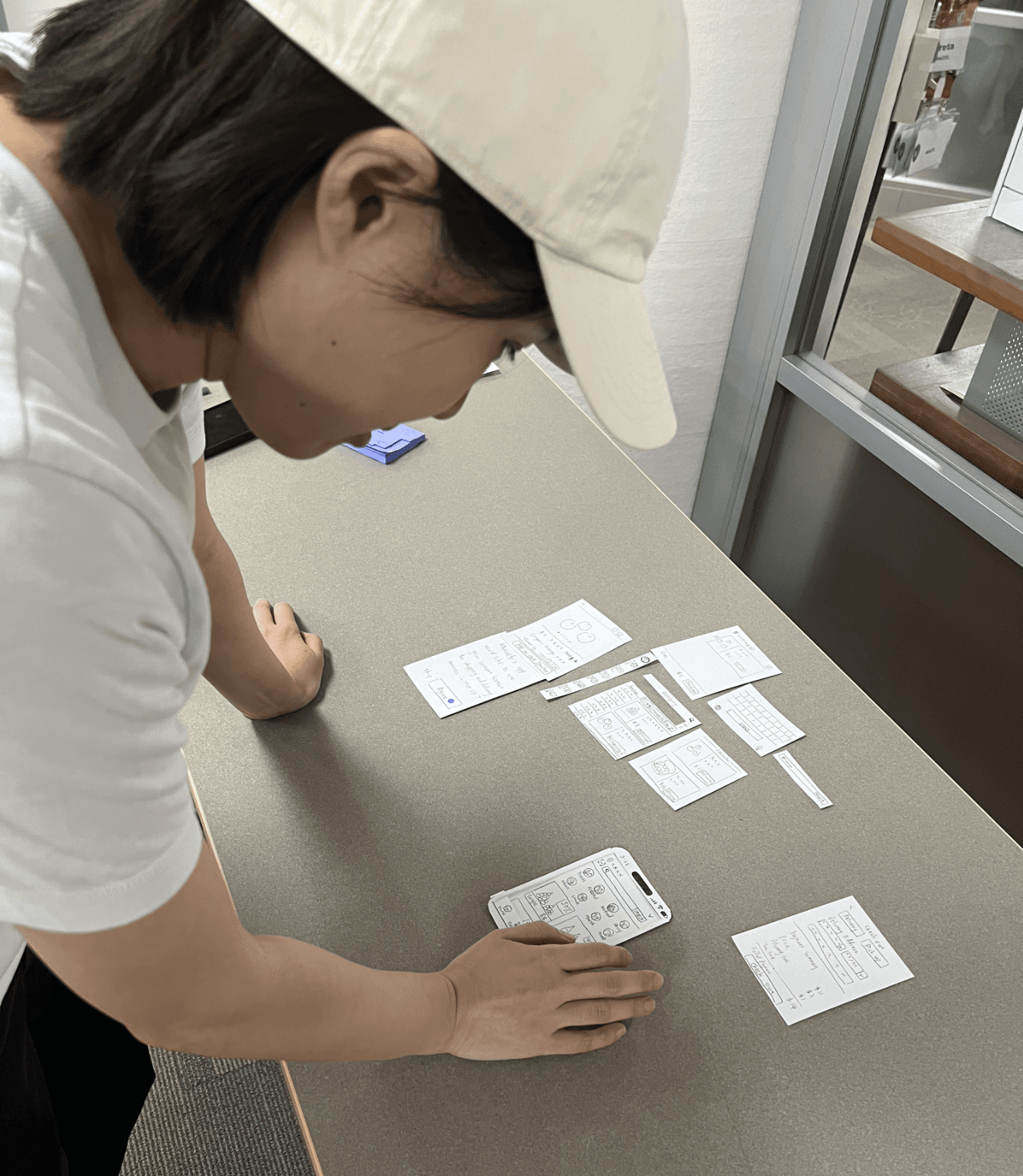
One participant Tested the Paper Prototype
Design
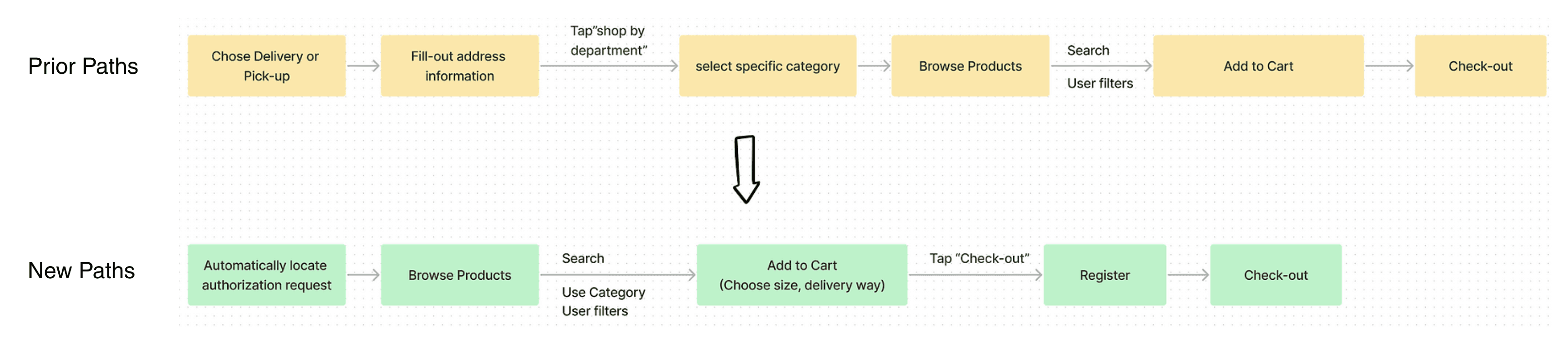
Prior Steps to browse Product List
Shorten Steps & Location Authorization
I updated the primary color of the previous Metcalfe’s Market website from dark green to bright orange, which was used as a secondary color, to promote faster purchasing decisions among users, minimizing second thoughts. Additionally, I retained green as a secondary color to symbolize eco-friendliness, aligning with Metcalfe's unique selling proposition of green power.
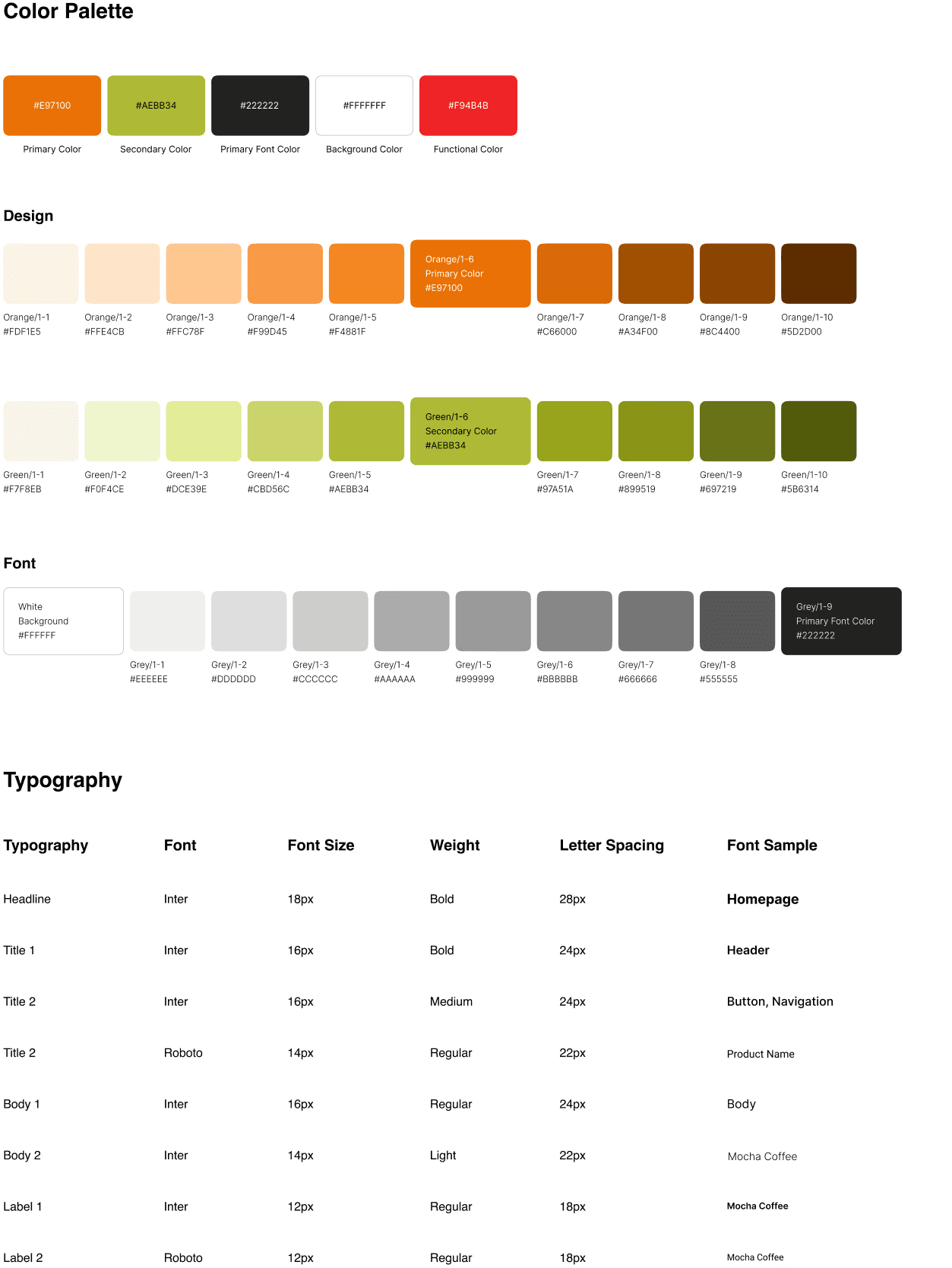
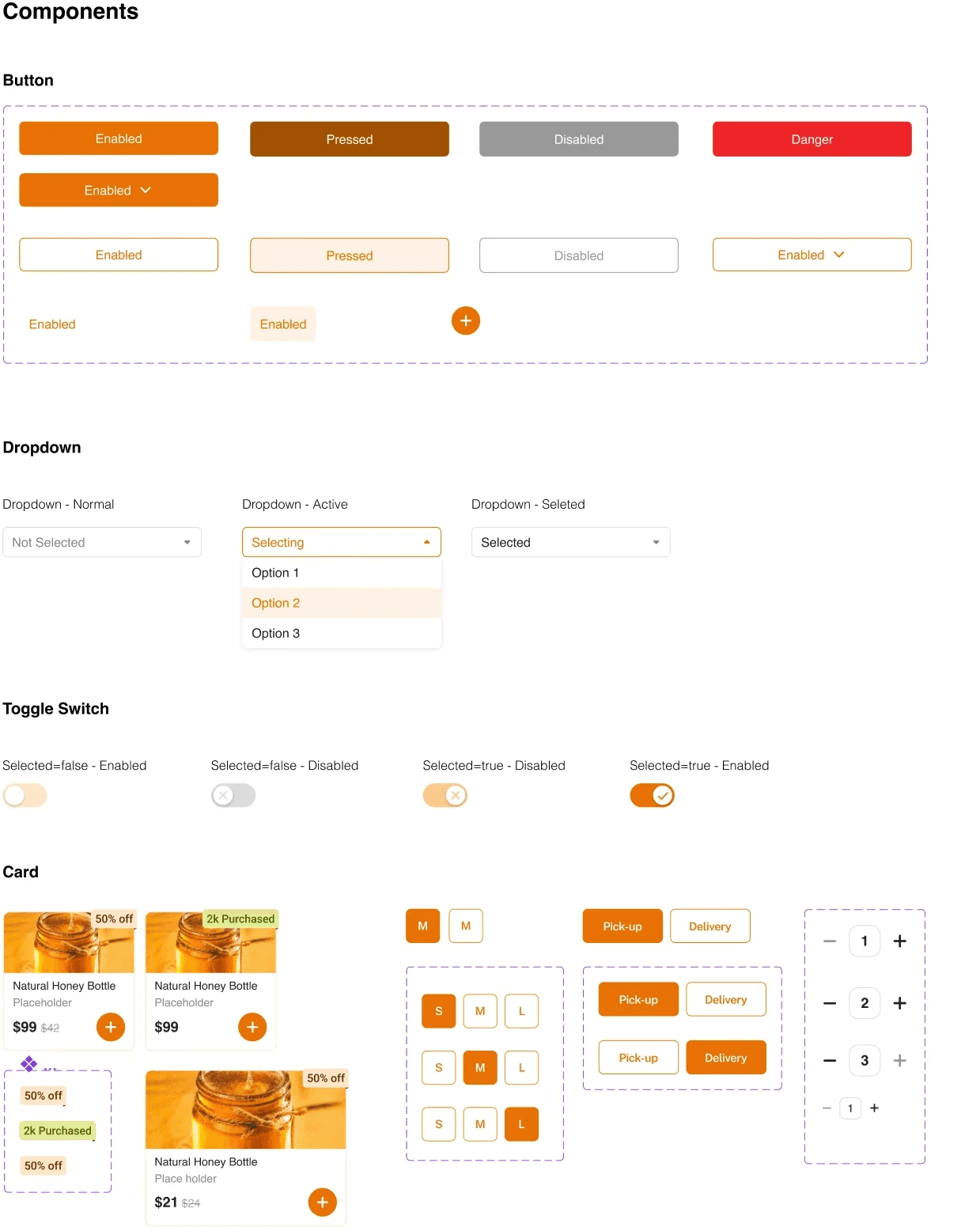
Design System
In moderated usability testing with 12 participants:
✅ 83% were able to locate and add a product to their cart within 2 min, compared to 33% in the original design.
✅ All participants rated the new navigation as “clear” or “very clear”.
✅ The task completion rate improved from 58% to 92%, and the average time-on-task decreased by 35%.